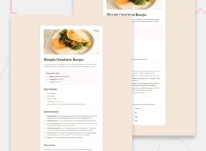
Design comparison
Solution retrospective
none
What challenges did you encounter, and how did you overcome them?none
What specific areas of your project would you like help with?none
Community feedback
- @porumbachanovPosted 10 months ago
Hi, nice work! I have a couple of suggestions that could improve the visual appeal.
-
You can add some transitions when switching from desktop to mobile view so that it doesn't clip.
-
The text is a different color than that show in the design, changing that color to the lighter grey color in the design will make things look much better.
-
The numbers in the ordered list are different from the design as well, you can color them with the given color by utilizing the
::markerpseudo element like so:
.instructions ol li::marker{color: ...}0 -
Please log in to post a comment
Log in with GitHubJoin our Discord community
Join thousands of Frontend Mentor community members taking the challenges, sharing resources, helping each other, and chatting about all things front-end!
Join our Discord
