
Solution retrospective
What are you most proud of, and what would you do differently next time?
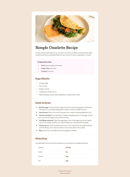
I tried mx best to structure the page that follows the design as close as possible. The devil is in the details. I used tags, not sure if it's correct here.
What challenges did you encounter, and how did you overcome them?The most challenging part was ensuring that the image is 100% wide on mobile, while it has padding around on tablet and desktop. I might have overthought it a bit, so I ended up choosing what I believe is the simplest solution: I applied the padding to the two child elements of the recipe element. Could there be a simpler or better solution?
Code
Loading...
Please log in to post a comment
Log in with GitHubCommunity feedback
No feedback yet. Be the first to give feedback on Adam's solution.
Join our Discord community
Join thousands of Frontend Mentor community members taking the challenges, sharing resources, helping each other, and chatting about all things front-end!
Join our Discord