Solution retrospective
What are you most proud of, and what would you do differently next time?
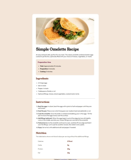
I am glad that I have been able to create this Recipe Page even though I got some challenges what I would do differently is to be clear on what things are going to be in different sections
What challenges did you encounter, and how did you overcome them?Designing the whole thing to be responsive but finally made it through by using @media and screen feature in Css
What specific areas of your project would you like help with?I would like to be helped in designing tables
Code
Loading...
Please log in to post a comment
Log in with GitHubCommunity feedback
No feedback yet. Be the first to give feedback on Otiro-John's solution.
Join our Discord community
Join thousands of Frontend Mentor community members taking the challenges, sharing resources, helping each other, and chatting about all things front-end!
Join our Discord