Solution retrospective
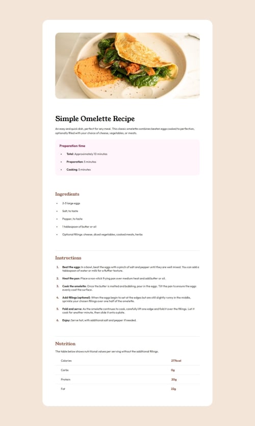
I have liked the way I tackled and understood the structure of the page were I structured the HTML in a way that I can target the classes/ sections better with CSS.
What challenges did you encounter, and how did you overcome them?I noticed that the tags weren't simply black but they were coloured, which I wasn't aware that this can be done (having the bullet point/ number with a colour and the text with a different one), therefore, I understood that I had to make the text in a inside the which this allowed me to give a separate colour to the .
What specific areas of your project would you like help with?Overall, I think that I have completed the challenge great, I worked as well on the responsiveness in order for the sizing and movements of the sections to make sense both on mobile, tablet and desktop.
Please log in to post a comment
Log in with GitHubCommunity feedback
No feedback yet. Be the first to give feedback on alphaura's solution.
Join our Discord community
Join thousands of Frontend Mentor community members taking the challenges, sharing resources, helping each other, and chatting about all things front-end!
Join our Discord