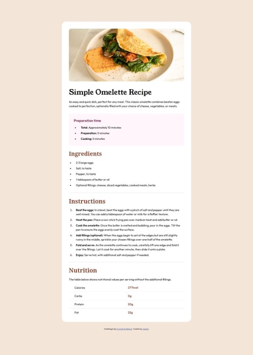
Design comparison
Solution retrospective
For some reason, the fonts on my page are displayed differently than they did in the design photo, despite the fact that I used the same fonts and weight that were given in the style guide. I don't know why and how to fix it.
Community feedback
- @asmthliPosted about 2 months ago
Nice work.
The font looks like it has some opacity on it - that'd explain the difference you can see. You can fix it by either changing the alpha value of the font colour, or changing the opacity property of the container.
Marked as helpful1@CaplexWPosted about 2 months ago@wansmth Unfortunately this is not the case. Adding opacity on the font make it look closer to the design, but it's not fixing the main problem. In closer look I can see the design font is slightly taller than my, while they keep the same width on the row. Because of it there is a small but annoying shift on the page when I switch between the pages.
0@sheriminPosted about 2 months agoHey @CaplexW ! I think the font issue is because you spelled it wrong? So it should be: font-family: 'Young Serif', serif;
not: font-family: 'Yong Serif', serif;
Marked as helpful1
Please log in to post a comment
Log in with GitHubJoin our Discord community
Join thousands of Frontend Mentor community members taking the challenges, sharing resources, helping each other, and chatting about all things front-end!
Join our Discord