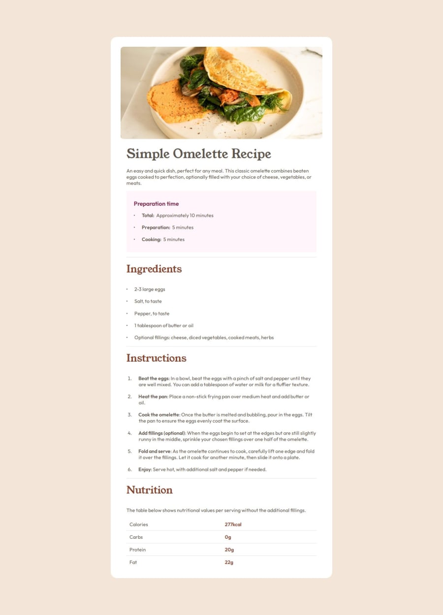
Design comparison
Solution retrospective
It took me a while to finish this solution while learning a couple of things. I think I could use grid or I could improve this solution if I receive any feedbacks!
What challenges did you encounter, and how did you overcome them?Initially I had issues with the indention between the bullet and their corresponding texts and in order to overcome that, I had to research a lot (chatgpt or Google or any resources available).
What specific areas of your project would you like help with?I personally had a hard time completely copying the part on mobile view where the text is vertically aligned per bullet... I tried flexbox and other available solutions on the internet however, I still am having some issues with it because of the (at least for some mobile screens bigger than the provided widths).
Community feedback
Please log in to post a comment
Log in with GitHubJoin our Discord community
Join thousands of Frontend Mentor community members taking the challenges, sharing resources, helping each other, and chatting about all things front-end!
Join our Discord
