Design comparison
Solution retrospective
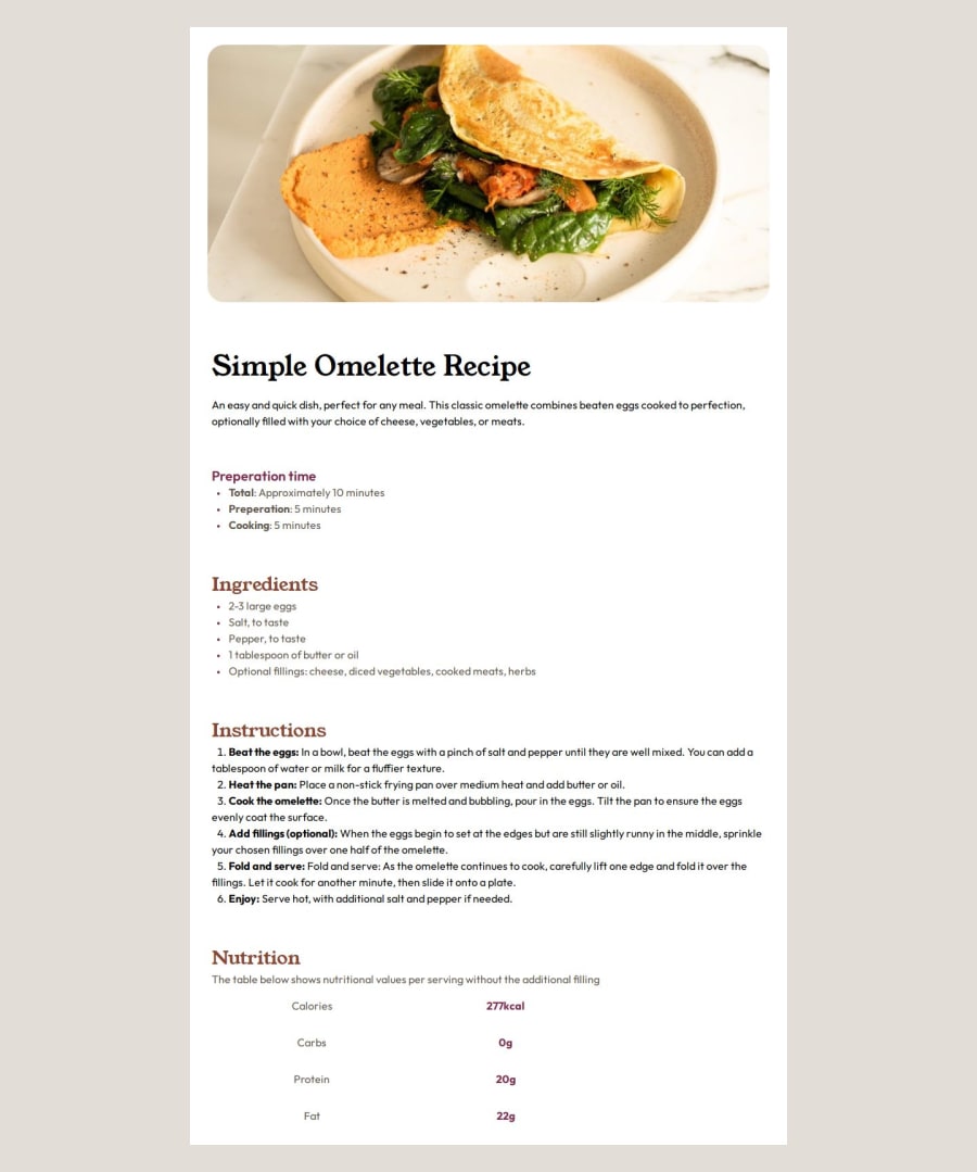
I took a mobile first approach here, working on a base design then using a media query to conditionally apply some CSS to format it for bigger viewports - in this instance a desktop, I definitely will be using this approach in the future as its simpler to work with.
What challenges did you encounter, and how did you overcome them?Issues with the images - especially responsiveness but using max-width and understanding it's relationship with the parent and child containers helped as it ensured that the content - image in this case - did not overflow it's parent container and stayed within the main container due to the max-width property which inherits it's width from the parent container.
What specific areas of your project would you like help with?Responsiveness General HTML & CSS Layout
I used CSS Grid for Nutritional Table previously and then changed it to a HTML Table
Community feedback
- @Balaji-webdevPosted 5 months ago
everything is nice but u can work on little things like border radius which makes it beautiful
0
Please log in to post a comment
Log in with GitHubJoin our Discord community
Join thousands of Frontend Mentor community members taking the challenges, sharing resources, helping each other, and chatting about all things front-end!
Join our Discord
