Design comparison
SolutionDesign
Community feedback
- @AroParadaPosted 5 months ago
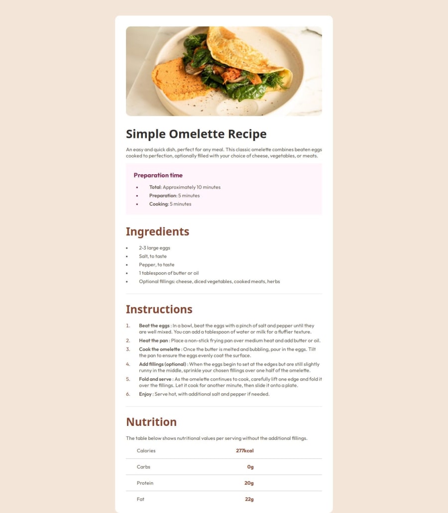
- use correct font
- add padding to bottom
- make card full width on mobile
Example for mobile code
` @media (max-width: 768px) { .card { width: 110%; /* Full width / height: 100%; / Full height / margin: 0; / Remove margin / border-radius: 0; / Remove rounded corners */ }
.image-container { padding: 0px; /* Adjust padding for smaller screens */ } img { border-radius: 0px; }
.cardBody { padding: 30px; /* Adjust padding for smaller screens */ } } `
0
Please log in to post a comment
Log in with GitHubJoin our Discord community
Join thousands of Frontend Mentor community members taking the challenges, sharing resources, helping each other, and chatting about all things front-end!
Join our Discord
