Design comparison
Solution retrospective
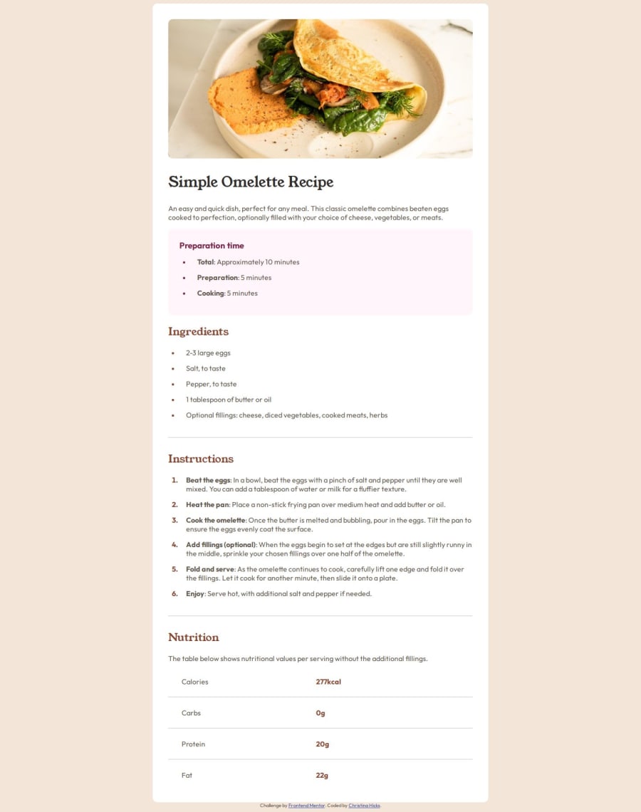
I learned about being able to style the list bullets and the text differently. Also, what initially looks like a table doesn't always have to use the table elements. I was able to style the Nutrition section easier by not using the table and using display: flex.
What challenges did you encounter, and how did you overcome them?Using the developer tools, and the different screen sizes caused issues when updating the stylesheet and then trying to view the changes. I kept getting Network issues. I just adjusted by screen size without using the developer tools.
What specific areas of your project would you like help with?Is there a better or different way I could have made the page responsive without using the media query?
Please log in to post a comment
Log in with GitHubCommunity feedback
No feedback yet. Be the first to give feedback on Christina Hicks's solution.
Join our Discord community
Join thousands of Frontend Mentor community members taking the challenges, sharing resources, helping each other, and chatting about all things front-end!
Join our Discord
