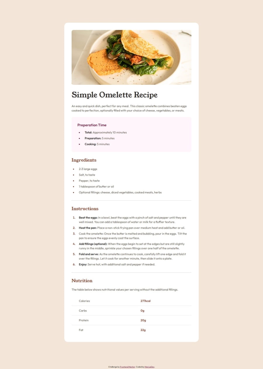
Design comparison
Solution retrospective
Well, at least i'm proud that i managed to build up a clean solution in a few hours and that I stayed within my personally set schedule.
What challenges did you encounter, and how did you overcome them?The hardest challenge was to adjust the square list markers. Because the design specifications specify a smaller font size, they unfortunately have a vertical offset, which I was unable to correct (in the normal way). Unfortunately, this is due to the lack of options for styling the pseudo element li::marker.
Another insight i get throughout this project was that horizontal lines ignore padding settings.
Community feedback
- @WiiDevYouSefPosted about 2 months ago
I like the touch that you add by styling the <li> instead of the point
0
Please log in to post a comment
Log in with GitHubJoin our Discord community
Join thousands of Frontend Mentor community members taking the challenges, sharing resources, helping each other, and chatting about all things front-end!
Join our Discord
