

Design comparison

Solution retrospective
please tell me where i should improve
Please log in to post a comment
Log in with GitHubCommunity feedback
- P@Lasha-Arveladze
Hello, there. Nice work, keep it up!!
There are some things that I can tell you to improve:
-
Use Semantic html --> What that means is that you used a lots of "div", which doesn't have any meaning in html, try to use "sections", "main", "footer" and etc just searched it up there are tons of them and your html code will be much more cleaner.
-
Try to use media queries for responsive design.
-
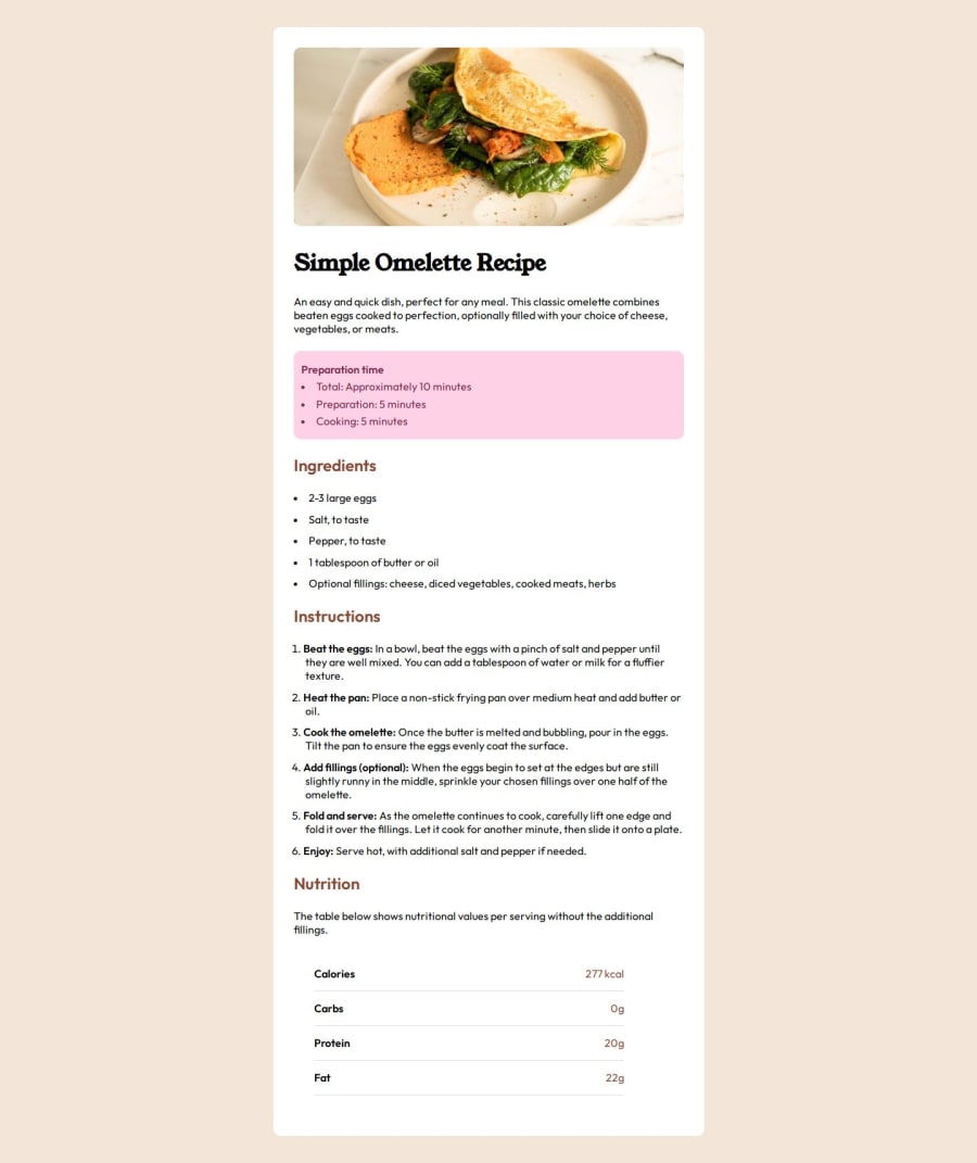
Also, don't use inline style in html as you did here: <span style="color: hsl(14, 45%, 36%);">277 kcal</span>
-
It will be the good practice if you will start using variables in CSS to declare things, as it will be easy to change things if needed (in big projects it is so helpful)
-
Always, try to build pixel perfect designs, this project lacks it and you can clearly see, when you see design and actual site, (wrong colors on texts and many more)
But, still this is the great achievement, Keep it up, you are doing great, this things needs to be the motivation to do another project even better, hope to see you in the near future ⭐
Marked as helpful -
- @Nakul460
nice work


Join our Discord community
Join thousands of Frontend Mentor community members taking the challenges, sharing resources, helping each other, and chatting about all things front-end!
Join our Discord