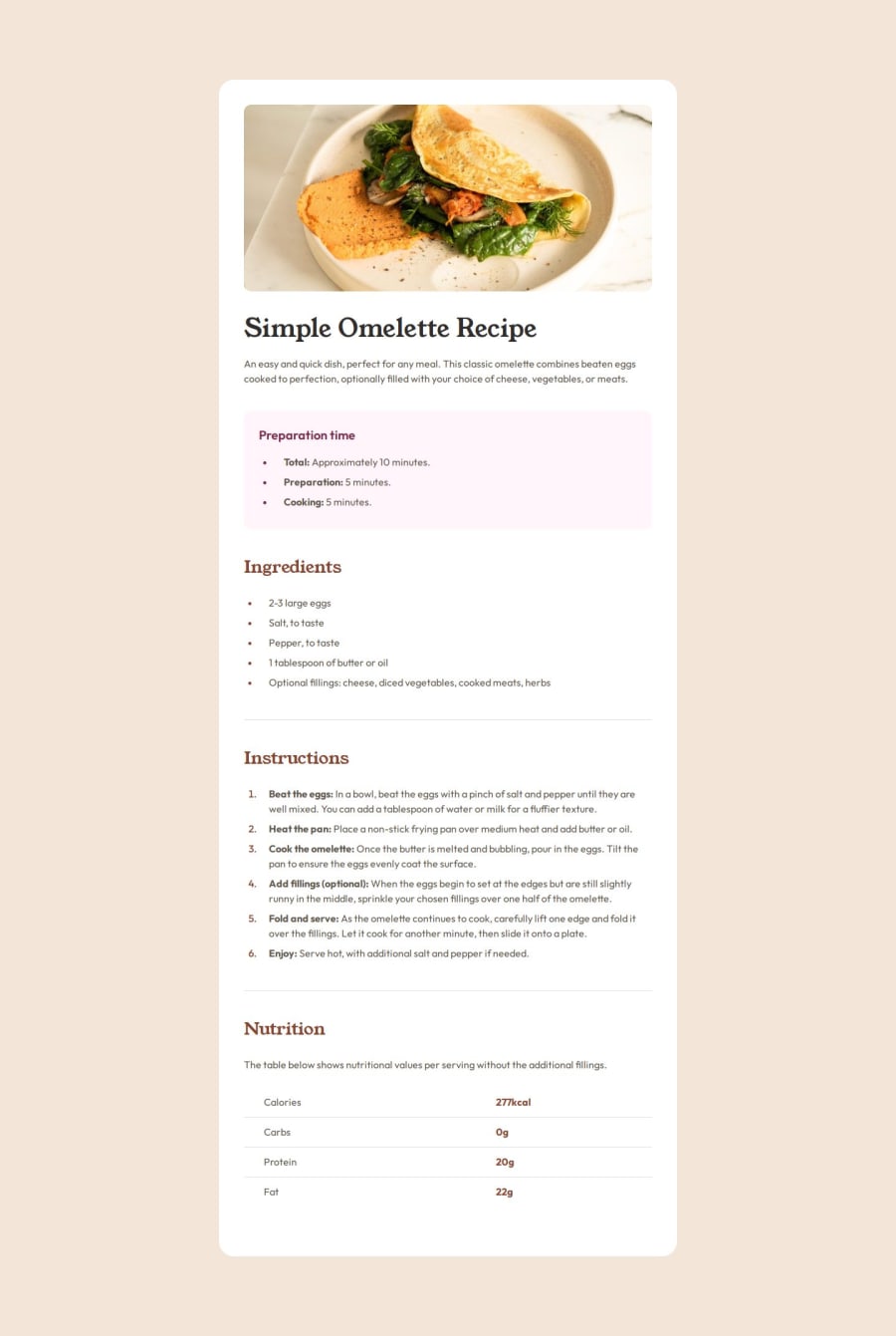
Design comparison
Solution retrospective
I did not encounter any significant challenges during this project.
What specific areas of your project would you like help with?- Could you check if everything matches the Figma design as expected?
- Can you suggest any improvements for my HTML and CSS?
- Are best practices for semantic HTML being used correctly?
- What would you recommend changing or improving?
Community feedback
- @Alex-Archer-IPosted 4 months ago
Hi there!
You were able to convince me about
div
wrapper for the texts in the qr challenge. But what is the need of two separatecard
andcomponent
divs and to wrap lists? =)By the way, very neat work, I learned a couple of tings here. Do you use some specific css reset?
1@indaqooPosted 4 months agoHi @Alex-Archer-I
But what is the need of two separate `card` and `component` divs
I did not understand this question :/
But regarding the section
div
's.. I'm not really sure, It's a habbit of mine. Since I've mostly used react at work, I usually have a component like thisconst Card = ({ title, children }: CardProps) => { return ( <div> <h2>{title}</h2> {children} </div> ) } const SomeContent = () => { return ( <div className="some specific class for this component flex-box or grid etc"> /* There can be multiple components here etc, like 2 lists or something*/ </div> ) } const Outcome = () => { return ( <Card title=""> <SomeContent /> </Card> ) }
which would be html of:
<section id="ingredients" class="ingredients"> <h2>Ingredients</h2> <div class="triple list"> <ul> <li>2-3 large eggs</li> <li>Salt, to taste</li> </ul> <ul> <li>2-3 large eggs</li> <li>Salt, to taste</li> </ul> <ul> <li>2-3 large eggs</li> <li>Salt, to taste</li> </ul> </div> </section>
Think of it like having a box (the card) with smaller compartments inside it. In this case unnecessary divs can be removed for sure :D Since I'm a backend dev I'm still learning the best practices etc as I go :D I've barely touched front-ends but yeah. :D
Yeah, I'm using a css reset by Josh W Comeau
1@Alex-Archer-IPosted 4 months ago@RobertsPeirags
Oh, I meant that you have
.container
element and.card
element inside it, end only than the content goes. Also you wrap every list into div while you can style it directly. So, a bit extra divs =)But since you use React, I can see why. By the way, you probably already know it, but you can use react components:
const Card = () => { return ( <> <h1>Title</h1> <p>Text</p> <button>Button</button> </> ); };
The only thing, that you can't add classes to them, only to inner content.
1@indaqooPosted 4 months ago@Alex-Archer-I
I’m using
<div class="container">
to center and manage the width of different sections, keeping everything aligned and consistent. In this project, it's just one component where this could be ignored, but I usually stick to this standard practice for building full websites.Each
.container
can be reused and styled differently, which helps with layout and design consistency.1@Alex-Archer-IPosted 4 months ago@RobertsPeirags
Oh, yeah, now I get you. Cool, I used this practice earlier too =)
1
Please log in to post a comment
Log in with GitHubJoin our Discord community
Join thousands of Frontend Mentor community members taking the challenges, sharing resources, helping each other, and chatting about all things front-end!
Join our Discord