Design comparison
Solution retrospective
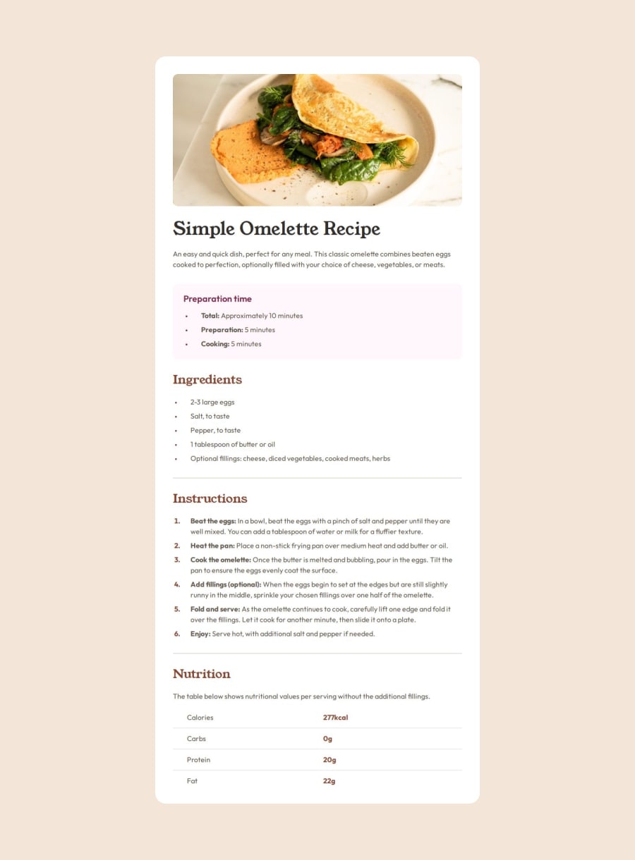
I styled the list marker and finely control the gap after the list marker according to the Figma design.
In particular in the mobile size, in the preparation section, I adjusted the gap after the list Marker and its size and I centered the list marker against the line break, positioning it midway between the line 'Total: Approximately 10' and minutes.
But I sacrifice the accessibility for screen reader on the list and over complicated the html and CSS. Is there any better way of doing it?
What specific areas of your project would you like help with?In mobile size, the image at the top will have a full width, and not having a padding just like the sections below it. But in the desktop size, it will have a padding the same as the sections below it.
I started off with giving overall padding to the white card, but it will give padding to the image padding in mobile size. So my approach is give padding to each sections individually. It is time consuming and not elegant.
I tried to keep the html as semantic as possible, I didn't want to div the sections into a big div and have an overall padding to it.
Please advise how I can do better.
Community feedback
- @zmora2622Posted 7 months ago
Great job! Watch out for differences between the screenshot and the design in figma - there's a big discrepancy in padding and margins. This is why often the designs created look different. Well-named classes. Do you have any resources on BEM and naming?
0P@edpauPosted 7 months ago@zmora2622 Thx for you comment. My BEM is ok, I am now refactoring it after getting advise from Grace Snow in discord. It is not a good practice to combine BEM-style naming with camelCase text.
0
Please log in to post a comment
Log in with GitHubJoin our Discord community
Join thousands of Frontend Mentor community members taking the challenges, sharing resources, helping each other, and chatting about all things front-end!
Join our Discord
