Solution retrospective
What are you most proud of, and what would you do differently next time?
This challenge was more complex than the others but I was proud to think it through and get to a solution faster and with more quality then the other times.
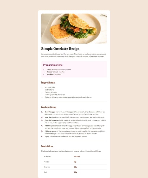
What challenges did you encounter, and how did you overcome them?The design with the image at the top is something that I couldn't find a way to solve it just now. I tried a couple of things but the result was not good.
What specific areas of your project would you like help with?The image at the top for smaller screen sizes.
Code
Loading...
Please log in to post a comment
Log in with GitHubCommunity feedback
No feedback yet. Be the first to give feedback on Anderson Moreira Silva's solution.
Join our Discord community
Join thousands of Frontend Mentor community members taking the challenges, sharing resources, helping each other, and chatting about all things front-end!
Join our Discord