Design comparison
Solution retrospective
My design skill, that I am very proud of.
What challenges did you encounter, and how did you overcome them?Tackel with list and just responsiveness.
What specific areas of your project would you like help with?NA
Community feedback
- @fayiz770Posted 11 months ago
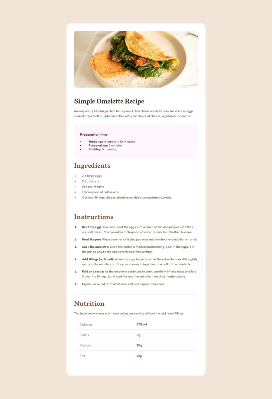
Design and Aesthetics: The design of your recipe page is visually appealing with a clean and organized layout. The use of contrasting colors for different sections (recipe, time, ingredients, instructions, and nutrition) enhances readability. The typography choices, with a serif font for headings and a sans-serif font for body text, create a pleasing hierarchy and improve the visual flow of the content.
Responsive Design: Your page adapts well to different screen sizes, particularly with the media query for screens under 720px. The adjustments to padding, image sizing, and the removal of decorative spans ensure that the content remains accessible and easy to read on smaller devices. This responsiveness is crucial for providing a good user experience across various devices.
Usability and Accessibility: The use of semantic HTML elements like <main>, <h1>, <h2>, and lists (<ul>, <ol>) enhances the structure and accessibility of the page. However, improving the alt text for the image from "img" to something more descriptive, such as "Omelette dish," would enhance accessibility for screen readers. Additionally, using more distinct hover effects for interactive elements could further improve usability.
Code Quality and Maintainability: Your CSS is well-organized and makes effective use of variables for colors and fonts, which aids in maintainability. However, consolidating font imports into a single request can optimize loading times. For example, combining the font imports into one line like so:
@import url('https://fonts.googleapis.com/css2?family=Outfit:wght@100..900&family=Young+Serif&display=swap');This reduces redundancy and simplifies the stylesheet. Additionally, ensure consistent use of class names (e.g., "Instructions" should be "instructions" for consistency with other class names). This attention to detail enhances both the readability and maintainability of your code.
0
Please log in to post a comment
Log in with GitHubJoin our Discord community
Join thousands of Frontend Mentor community members taking the challenges, sharing resources, helping each other, and chatting about all things front-end!
Join our Discord
