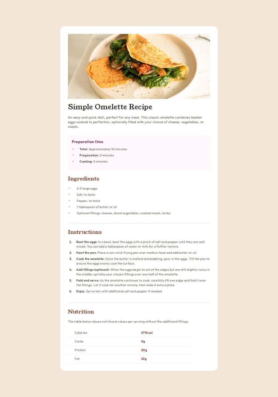
Design comparison
Solution retrospective
I found this project much harder than I expected. There were a lot of new things I needed to research and issues to figure out. However, I managed to get through all of them except for making the image full width on the mobile view and the title on mobile look like the design.
What challenges did you encounter, and how did you overcome them?I think I made it hard for myself by trying new things in the CSS that didn't work and getting mixed up with the inheritance. I also found the spacing and layout challenging with the OL and UL sections, especially the spacing between the bullet points.
What specific areas of your project would you like help with?Does anyone know how to fix the header image on the mobile view so that it is full width and the h1 to fit on two lines instead of three? Everything else is pretty much there, but if you see anything, I would be very grateful for the feedback. Thank you. :-)
Join our Discord community
Join thousands of Frontend Mentor community members taking the challenges, sharing resources, helping each other, and chatting about all things front-end!
Join our Discord
