Submitted 3 months ago
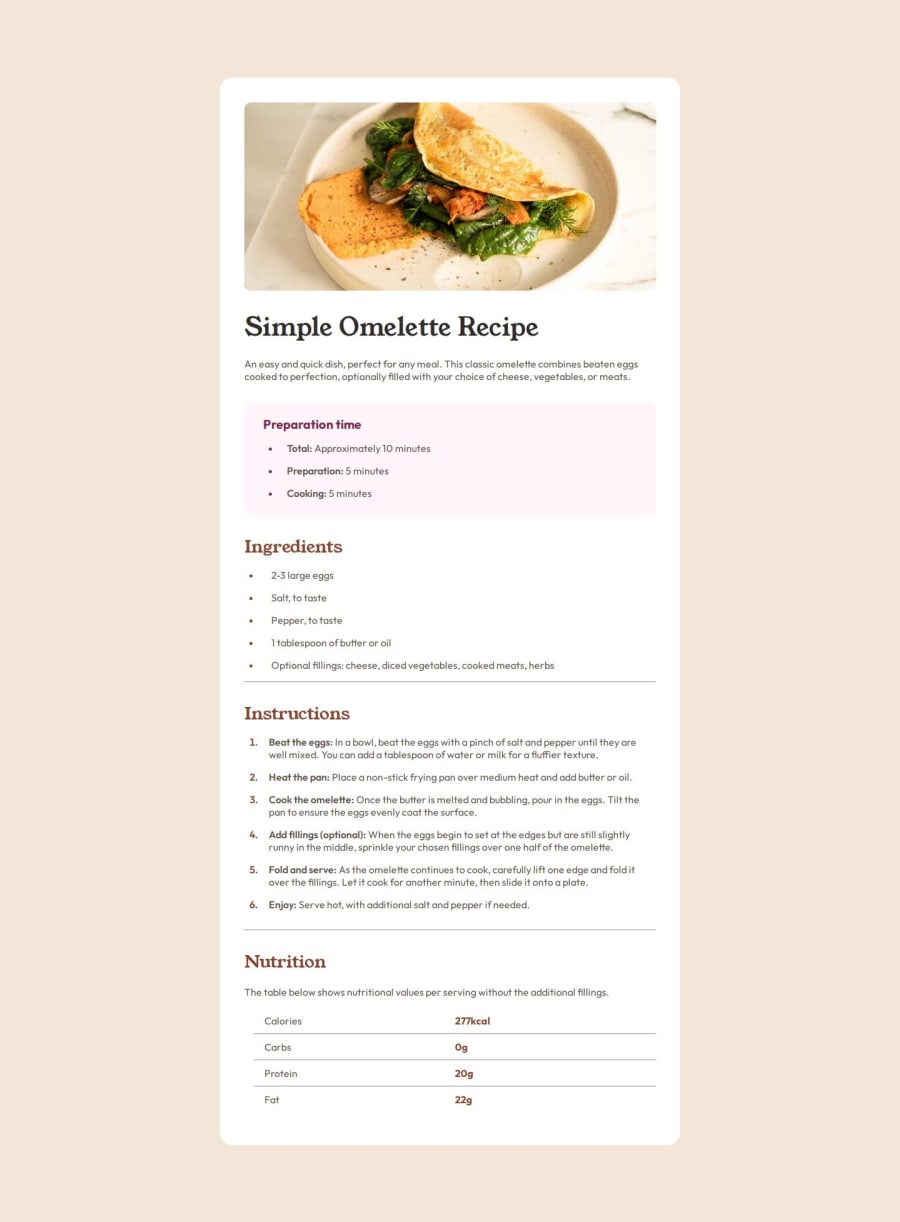
Responsive Recipe Main Page using CSS, Flexbox and Grids
#accessibility

@k-hroma

Design comparison
SolutionDesign

Solution retrospective
What are you most proud of, and what would you do differently next time?
I have started working with relative units to improve scalability and flexibility of the design. Also first time working with grids.
What challenges did you encounter, and how did you overcome them?I generally find the biggest problems in finding the right measurements of paddings and margins in flexbox and grids
What specific areas of your project would you like help with?I would like you to help me in good practice and writing of both the html code and the css code.
Community feedback
- @Lokesh8055Posted 3 months ago
@k-hroma,
- The horizontal line color looks a bit off from the design provided
- The card size and all the content inside it gets very small when i change it to responsive mode and check for different screen sizes
- keep the container-title and time in a seperate section container.
- also use min-height and keep value to 100svh in the main tag instead of keeping it in rem value
please check all these points
Marked as helpful0

Please log in to post a comment
Log in with GitHub
Join our Discord community
Join thousands of Frontend Mentor community members taking the challenges, sharing resources, helping each other, and chatting about all things front-end!
Join our Discord