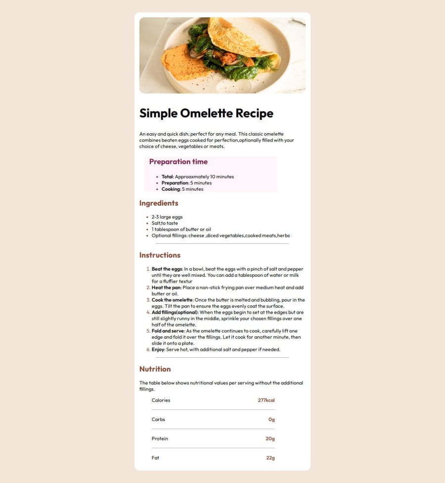
Responsive Recipe , list, flex and REM as font defaults


Design comparison

Solution retrospective
Actually, I have nothing to be proud of. My CSS seems to be all over the place because I was improvising it the entire time. My code editor work doesn't match what I posted to GitHub, and I'm exhausted of having to make adjustments.
What challenges did you encounter, and how did you overcome them?I struggled a lot with font size for different screens. Font size that actually worked for @(max-width: 425px ) don't work for (min-width: 768px ) I don't understand how cause I used rem instead of px.
What specific areas of your project would you like help with?Font size at different screen sizes. CSS code best way to approach it and how to create a clean code
Community feedback
- @PjoabePosted 8 months ago
Good job with the solution!
You’ve encountered issues with font sizes across different screen sizes, which is a common challenge. It seems that your use of rem units isn’t behaving as expected. One approach to handle this is to use a responsive typography technique, like setting a base font size in the root element (html) and using rem units for relative sizing. Additionally, consider using media queries to adjust font sizes at different breakpoints to ensure they look good on all screen sizes.
Marked as helpful1@Sirch9Posted 8 months ago@Pjoabe Thank you for taking your time, to view my efforts.
- I have never heard of typography technique, I will learn that.
- Base fonts/root elements ? So much to learn.
- Media Queries, How many should I have ? I use 2 only (min-width:320)and (min-width: 768) is it standard practice ?
Thank you for your feedback much appreciated.
0@Sirch9Posted 8 months ago@Pjoabe Thank you for taking your time, to view my efforts.
- I have never heard of typography technique, I will learn that.
- Base fonts/root elements ? So much to learn.
- Media Queries, How many should I have ? I use 2 only (min-width:320)and (min-width: 768) is it standard practice ?
Thank you for your feedback much appreciated.
0

Please log in to post a comment
Log in with GitHub
Join our Discord community
Join thousands of Frontend Mentor community members taking the challenges, sharing resources, helping each other, and chatting about all things front-end!
Join our Discord