Solution retrospective
What are you most proud of, and what would you do differently next time?
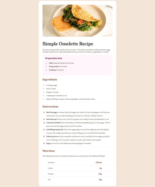
I'm proud of how I made this almost exactly like the original desing, I thought it would be very difficult, but it wasn't like that! I would like to search more resources for making responsive pages though.
What challenges did you encounter, and how did you overcome them?I wasn't sure how to make it responsive for mobile, so I just change the display until it looked fine. I also didn't know how to display the image for mobile, so I just moved it with margin -px
What specific areas of your project would you like help with?I would like to know how to make the brown text in the table like it was in the image desing.
Code
Loading...
Please log in to post a comment
Log in with GitHubCommunity feedback
No feedback yet. Be the first to give feedback on Luca's solution.
Join our Discord community
Join thousands of Frontend Mentor community members taking the challenges, sharing resources, helping each other, and chatting about all things front-end!
Join our Discord