Design comparison
Solution retrospective
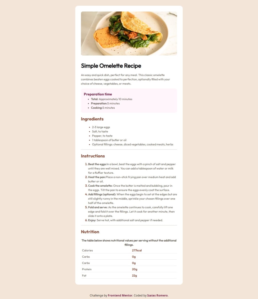
I practice tables tags, manage better the @font-face this time, responsive and media querys practice worth it.
What challenges did you encounter, and how did you overcome them?I use fonts provided, but it didn´t match the desing. 🤷♂️ i tried aplying font-styles: oblique / italic.
Community feedback
- @tttam0113Posted 6 months ago
-
I noticed that you're focusing a lot on colors in your website, but you should also pay attention to spacing to better match the design.
-
I see that you've defined the font "Young Serif," but you're loading the font "Outfit" instead. This causes the title and subtitle to not match the design.
-
You could use some semantic HTML5 markup to make your website more meaningful and readable. For example, you should group the "Ingredients" (subtitle and list) into a <section> tag.
-
In my opinion, you don’t need to define a class for table rows or table data to avoid overcomplicating things. Instead, you can style the table, <tr>, and <td> selectors directly.
Marked as helpful1@Isa696Posted 6 months ago@tttam0113 ty for you feedback. I'll try that. About classes, I felt the same. Too many classes all around 😵💫 I'll try to fix that in next challenges
0 -
Please log in to post a comment
Log in with GitHubJoin our Discord community
Join thousands of Frontend Mentor community members taking the challenges, sharing resources, helping each other, and chatting about all things front-end!
Join our Discord
