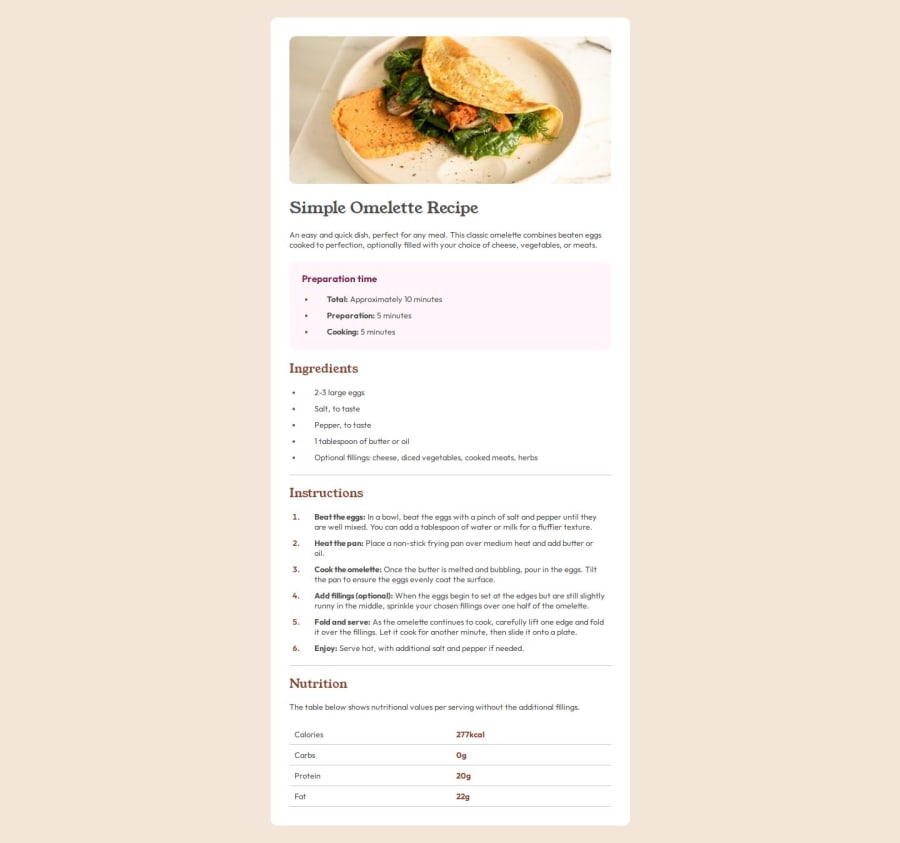
Design comparison
Solution retrospective
Figuring out wrapper div
What challenges did you encounter, and how did you overcome them?I didn't remember how to create the break line or adjust it's appearance, googled it
What specific areas of your project would you like help with?Nothing, i'm ready to move on from cards
Please log in to post a comment
Log in with GitHubCommunity feedback
- @dylan-dot-c
Looking good, other than the spacing/sizing there are a few things you can improve semantically.
You could make use of the main element for the first div you have in the webpage and for each sections of the cards, you don't actually separate them semantically so you can have a section for each h2/h3 you have.
On mobile the markers for the ul should be centered vertical to the li text. Small feature so don't worry.
Finally it would be better to have the header wrap the img, h1 and the text which would be a p tag.
Anyways good job and looking for to see more solutions from you. You can also take a look at mine and see what could have been done differently.
- P@Y39WebDeveloper
a
Join our Discord community
Join thousands of Frontend Mentor community members taking the challenges, sharing resources, helping each other, and chatting about all things front-end!
Join our Discord
