
Solution retrospective
Getting the design mostly accurate. i think i would've probably done less on getting the inbetween sizes working correctly and sticked to the desktop and mobile view only.
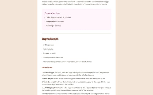
What challenges did you encounter, and how did you overcome them?Whilst i was able to get the desktop and mobile versions to the design, inbetween sizes of height were incredibly difficult to figure out how to fix the overflowing top part of the card. It looked like the flexbox was actually causing this problem and was unable to find a solution to center the card without, despite thinking about floats or using auto margin.
Additionally getting the padding between the bullet point and the text in the list was really challenging, solutions made to seem this was relatively easy but nothing seemed to work, using ::marker, using ul or li padding/margin. Not quite sure why!
What specific areas of your project would you like help with?Better responsiveness on intermediate desktop sizes, the card overflows on my own laptop for example.
A better way to add padding on the bullet point lists.
Please log in to post a comment
Log in with GitHubCommunity feedback
No feedback yet. Be the first to give feedback on Aaron Smith's solution.
Join our Discord community
Join thousands of Frontend Mentor community members taking the challenges, sharing resources, helping each other, and chatting about all things front-end!
Join our Discord