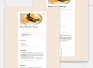
Design comparison
Solution retrospective
I'm most proud of successfully creating a clean and visually appealing profile card that combines functionality with a modern, minimalist design. The layout effectively showcases social links and profile details in a responsive, user-friendly format. Next time, I would focus on enhancing interactivity by incorporating subtle animations and hover effects to make the user experience more engaging. I’d also aim to improve accessibility by adding ARIA labels and optimizing for screen readers, ensuring inclusivity. Additionally, I’d consider integrating backend support, allowing dynamic data retrieval for a scalable, customizable profile card solution. Reflecting on this project has shown me opportunities to add creativity and expand functionality in future versions.
What challenges did you encounter, and how did you overcome them?One of the main challenge was creating a visually appealing yet simple design without overcomplicating the code. I focused on using minimal styling, sticking to a cohesive color scheme, and leveraging CSS properties like border-radius and box-shadow to add subtle touches that enhanced the design without cluttering it. Overall, careful testing and iteration helped me refine the layout and styling, ensuring that the final product looked and worked as intended.
Community feedback
- @AlgoBenderDailyPosted about 2 months ago
You can check my tutorial on how I went about it ~ https://www.youtube.com/watch?v=T37LxmzVpVI
Marked as helpful0
Please log in to post a comment
Log in with GitHubJoin our Discord community
Join thousands of Frontend Mentor community members taking the challenges, sharing resources, helping each other, and chatting about all things front-end!
Join our Discord
