Design comparison
Solution retrospective
just aligments
What challenges did you encounter, and how did you overcome them?trying to copy the exact widths and heights of the design
Community feedback
- @qutubahmed732Posted 5 months ago
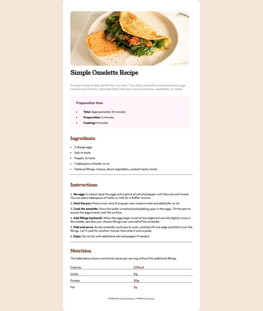
Hey everyone! Just wanted to share a little review on the recipe page I created. I focused on keeping the layout clean and user-friendly, making it easy to follow the steps. Here’s a quick overview:
Presentation: I organized the ingredients and instructions separately, so it’s simple for users to read through each section without getting overwhelmed. I might add a few icons or images alongside each step to make it feel even more engaging and visually interesting.
Readability: I chose a clear font for easy reading, but I’m thinking about bumping up the font size for the instructions a little to make it even easier on the eyes.
Images: I added some delicious-looking food photo to keep the page lively. I’m considering adding a subtle hover effect on the images for a touch of interactivity.
Personal Touch: I’m thinking about adding a short intro for each recipe—maybe a fun fact or a little story about why I love it. I feel like this would make the page feel more personal and relatable.
Mobile View: I’ve tested it on mobile, but I’d love some feedback on how it looks on smaller screens. I want it to be just as functional on phones since many people use their devices while cooking!
I’d love any feedback or suggestions to make it even better. Thanks for taking a look! 😊
0
Please log in to post a comment
Log in with GitHubJoin our Discord community
Join thousands of Frontend Mentor community members taking the challenges, sharing resources, helping each other, and chatting about all things front-end!
Join our Discord
