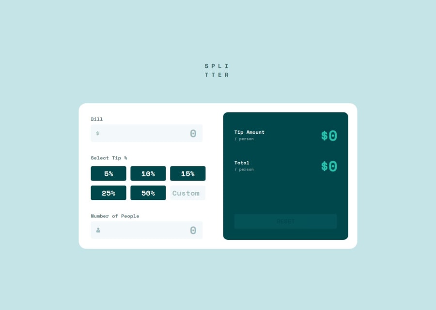
Responsive React Tip Calculator App
Design comparison
Community feedback
- P@richardcyrusPosted 8 months ago
Hello, great job on completing the challenge!
I have a suggestion about your code that may interest you.
You may want to consider using inputs of type radio for the tip selection area of the page. It would provide basic accessibility support and keyboard navigation of the section. Currently that section of the page is skipped when navigating by keyboard.
For example, instead of (in
/src/Inputs/Inputs.jsx):{[5, 10, 15, 25, 50].map((value) => ( <div key={value} className={`inputs__select-tip--tips_btn ${ activeTip === value ? "active" : "" }`} onClick={() => handleTip(value)} > {value}% </div> ))}Try:
  {[5, 10, 15, 25, 50].map((value) => (
    <label key={value} htmlFor={`tipPercent-${value}`} className="inputs__select-tip--tips_btn">
      <input
        id={`tipPercent-${value}`}
        name="tip-percent"
        type="radio"
        value={value}
        checked={activeTip === value}
        onChange={(e) => handleTip(e.target.value)}
      />
      {value}%
    </label>
  ))}
With the changes, keyboard navigation would allow for the selection of one of the standard tip amounts, the label can be used to form the visual 'button', and the checked state of the radio input can be used for the active styling. Also by using a group of radio buttons, the browser will ensure that only one can be active at any given time.
I hope you find this useful. Happy coding.
Marked as helpful1@SabinaCristeaPosted 8 months ago@richardcyrus thank you for your feedback. I didn't think about that, so your comment is very helpful
0
Please log in to post a comment
Log in with GitHubJoin our Discord community
Join thousands of Frontend Mentor community members taking the challenges, sharing resources, helping each other, and chatting about all things front-end!
Join our Discord
