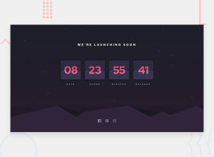
Design comparison
SolutionDesign
Solution retrospective
While working on this project, I found centering elements while maintaining responsiveness to be challenging, especially with the flip clock design. How do you tackle such alignment issues in your projects, and are there any CSS tricks or practices you find indispensable?
Community feedback
Please log in to post a comment
Log in with GitHubJoin our Discord community
Join thousands of Frontend Mentor community members taking the challenges, sharing resources, helping each other, and chatting about all things front-end!
Join our Discord
