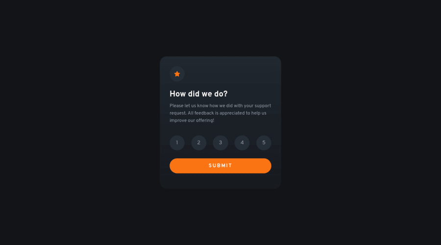
Design comparison
Solution retrospective
Is it easier to first start with the mobile phone dimensions ? is there any way i can improve this ?
Leave your thoughts
Community feedback
- @EdwinSchPosted over 2 years ago
Hi! Good solution, I like how you added the flipping animation. About your question; I wouldn't say one thing is better or faster than the other. In general my experience is that "mobile-first" is the modern starting point as consumers do most stuff on their phones these days. It really depends on the (expected) type of end user in most cases.
side-note tho: if you are planning on using a library like Tailwind CSS in the future it is actually more easy to start with mobile screens as the default breakpoints of Tailwind are set to break from small to large.
Marked as helpful1
Please log in to post a comment
Log in with GitHubJoin our Discord community
Join thousands of Frontend Mentor community members taking the challenges, sharing resources, helping each other, and chatting about all things front-end!
Join our Discord
