Design comparison
Solution retrospective
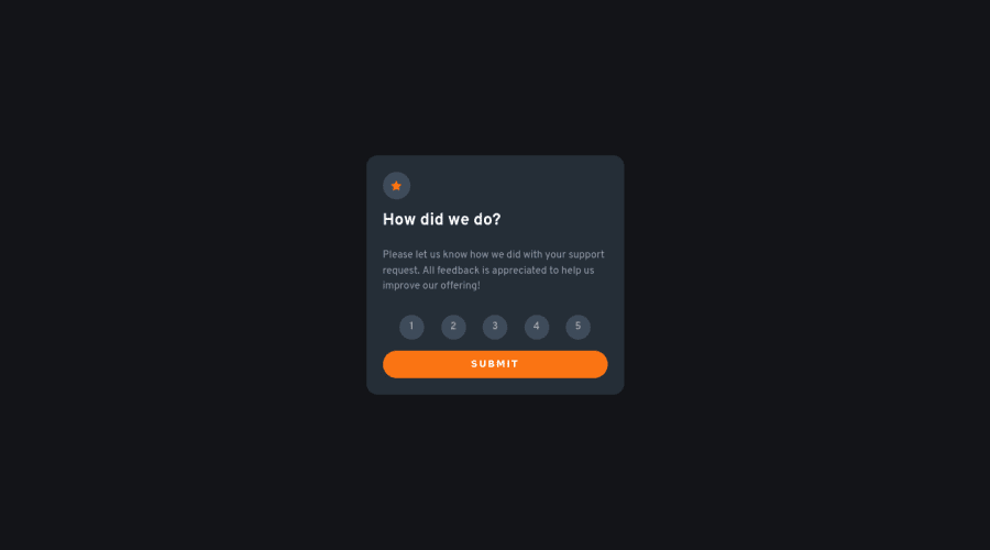
The texts are actually elevated up a bit. It messes with centering. If you look closely in the rating icons, you can notice the text is not centered correctly. I found that it is being caused due to the font-family. Anyone know the Issue ? Other Feedbacks are appreciated. Thank you in advance
Community feedback
- @cholis04Posted over 2 years ago
Congratulations on your work.
I guess you can assign value to justify-content to
space-betweenso that the spacing between buttons is equal and fills the wrapper on the form.export const RatingIcons = styled.form` display: flex; justify-content: space-between; // Replace space-evenly margin-bottom: 1em; `Marked as helpful0@Away87Posted over 2 years ago@cholis04 Hey thanks for the feedback. It looks good. I also made the icons a bit more big. It fits 👍
1 - @remtainePosted over 2 years ago
Looks pretty good! The logic for the rating input works as well. Regarding centering text, I'll throw out some ideas you may try. One method would be turning the buttons into a flexbox and then centering it on the y axis. Alternatively, you may also try setting the vertical-align to middle. You could also just add a bit more padding at the top of the text, though that's a less responsive solution.
0@Away87Posted over 2 years ago@remtaine Hey, thank you for the feedback. The icon is actually a div and the text is a ::before . I have already centered it with display flex. It just doesn't work. But when I remove the font-family it centers. The padding really works.. but like you said its not a responsive way and not exact ( because I have to tweak with pixels. )
0
Please log in to post a comment
Log in with GitHubJoin our Discord community
Join thousands of Frontend Mentor community members taking the challenges, sharing resources, helping each other, and chatting about all things front-end!
Join our Discord
