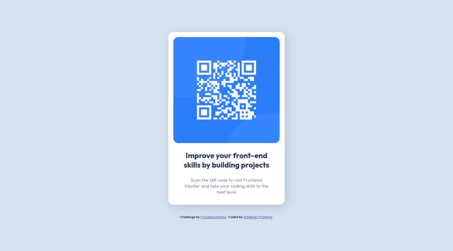
Responsive QR-Component using CSS Flexbox
Design comparison
Solution retrospective
I'm not sure about the HTML and CSS I'm writing. I feel like my code can do less than I do and is it any good if I declare lots of classes in HTML? sometimes it's annoying and the reason for doing it is because I think it's the best even though other people can do it with less class. Can you give me a solution to make my HTML and CSS classes more efficient?
Community feedback
- @HassiaiPosted over 1 year ago
Replace <section class="container"> with the main tag to fix the accessibility issues. click here for more on web-accessibility and semantic html
Give the alt attribute in the img a value. The value of the alt attribute is the description of the image. For decorative images like icons, there is no need to give it an alt value, for more on alt attribute Click here.
There is no need to give .container a width.
To center .qr-component-wrap on the page using flexbox, replace the height in .qr-component with min-height: 100vh.
Reduce the max-width of .qr-component-wrap for it to be equivalent to the design.
max-width:20rem/em which is 320px
.For a responsive image, replace the width in .qr-img with max-width.
Give .qr-text a margin value for all the sides, text-align: center and a font-size of 15px which is 0.9375rem, this will be the font-size of both p and h1. Give p a margin-top or h1 a margin-bottom value for the space between the text.
Hope am helpful.
Well done for completing this challenge. HAPPY CODING
Marked as helpful0 - @0xabdulPosted over 1 year ago
Hey there well congrats on completing the Qr code component ..π€©
- A little suggestion for improve your code ..
- In Html π·οΈ :
- the html page should be contained one main landmarkβ
- to clear the Accessibility reports use sematic elements or non semantic elements..
- Semantic elements π’
- <aside>
- <nav>
- <section>
- <main>
- <header>
- <footer>
- <article>
- ect...
- using semantic elements
- Ex :
<html lang="en"> <head> <title>my page</title> </head> <body> <header> //logo img or heading ect... //Using heading onlyβ </header> <main> //Use only main of the contents </main> <footer> //use copy write discription or challenge d by front end mentor code by mark.. </footer> </body> </html>
- I hope it's useful for youβ
- happy Codding
Muhammad Raihan Pratama
π€©
Marked as helpful0 - @PipouwPieuwPosted over 1 year ago
Hello and well done completing your first challenge!
To answer your question, I don't see anything wrong with using lots of classes. I'd even say it's best to target a class rather than a tag name like
div / h1 / p
etc.Frameworks like Bootstrap and Tailwind heavily rely on classes, same for the BEM methodology, and it's perfectly fine! Classes exist so they can be used this way. :)
Your component looks good both in desktop and mobile mode. There are a few HTML issues you could fix, everything is listed in the reports above and they're quite self explanatory.
Well done and keep going!
0 - @0xabdulkhaliqPosted over 1 year ago
Hello there π. Congratulations on successfully completing the challenge! π
- I have other recommendations regarding your code that I believe will be of great interest to you.
HTML π·οΈ:
- This solution generates accessibility error reports, "All page content should be contained by landmarks" is due to incorrect usage of
semantic
markup, which causes lacking of landmark for a webpage
- So fix it by replacing the
<section class="container">
element with the semantic element<main>
in yourindex.html
file to improve accessibility and organization of your page.
- What is meant by landmark ?, They used to define major sections of your page instead of relying on generic elements like
<div>
or<span>
- They convey the structure of your page. For example, the
<main>
element should include all content directly related to the page's main idea, so there should only be one per page
.
I hope you find this helpful π Above all, the solution you submitted is great !
Happy coding!
0
Please log in to post a comment
Log in with GitHubJoin our Discord community
Join thousands of Frontend Mentor community members taking the challenges, sharing resources, helping each other, and chatting about all things front-end!
Join our Discord