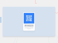
Design comparison
Solution retrospective
all Feedback is wellcomed
Community feedback
- @PhoenixDev22Posted over 2 years ago
Hello david,
Congratulation on completing your first challenge. your solution looks great. I have some suggestions regarding your solution:
-
First of all, it’s better to have all the styles in a separate file.
-
Remove the extra text there in the body.
-
The component should live in the
< body>not the<head> -
Use the
<main>landmark to wrap the body content(card) as HTML5 landmark elements are used to improve navigation experience on your site for users of assistive technology. -
To tackle the accessibility issues:
- Page should contain <h1> . In this challenge , as it’s supposed to be a part of a whole page, you may use
<h1>withsr-onlyclass hidden visually and present for assistive tech users.
- Page should contain <h1> . In this challenge , as it’s supposed to be a part of a whole page, you may use
-
The alternate text should be present in that image as it’s an important content (informative image)
CSS:
If your web content font sizes are set in absolute units, such as pixels, the user will not be able to re-size the text or control the font size based on their needs. Relative units “stretch” according to the screen size and/or user’s preferred font size, and work on a large range of devices.
- Using percentages for widths, using max-width and avoiding to set heights for the components , with these things is the key to mastering responsive layouts.
Aside from those , great job on this one.
Marked as helpful0 -
Please log in to post a comment
Log in with GitHubJoin our Discord community
Join thousands of Frontend Mentor community members taking the challenges, sharing resources, helping each other, and chatting about all things front-end!
Join our Discord

