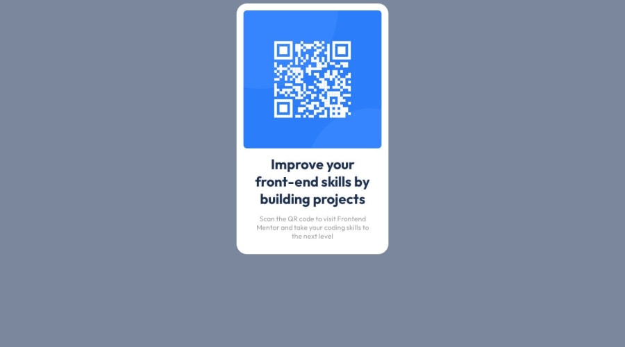
responsive qr-code-component with flexbox and html
Design comparison
Solution retrospective
I didn't encounter any difficulty in solving it, but I delivered the project with a lot of delay due to the idea of being a perfectionist, which has been one of the biggest barriers to my progress. I was trying to keep the layout as shown in the image.
Community feedback
- @NehalSahu8055Posted about 1 year ago
Hello Coder 👋.
Congratulations on successfully completing the challenge! 🎉
Few suggestions regarding design.
- To properly center the card
- USING FLEXBOX
body{ display: flex; justify-content: center; align-items: center; min-height: 100vh; ... }-
For
non-decorative imagesgive meaningful and descriptive alt likealt= "QR code to frontend mentor website". -
Use
responsive units(rem, em, %)from next project. Explore respective use cases on google.
I hope you find this helpful.
Happy coding😄
0 - @NihalP01Posted about 1 year ago
You are doing great. Take your time and enjoy doing it.
Few tips: I have centered this card by using these CSS properties:
position: absolute; top: 50%; left: 50%; transform: translate(-50%, -50%);
Please give it a try and play around with it.
Another suggestion would be to give attention to the font sizes. Good luck :-)
0 - @danielmrz-devPosted about 1 year ago
Hey, @WalanyCosta!
Your project looks great! Congrats!
Here are a few tips to improve it:
You can place the card in the middle of the page doing this: body { height: 100vh; display: flex; justify-content: center; align-items: center; }
Also, try reducing the <h1> font-size a little bit.
Hope it helps!
0
Please log in to post a comment
Log in with GitHubJoin our Discord community
Join thousands of Frontend Mentor community members taking the challenges, sharing resources, helping each other, and chatting about all things front-end!
Join our Discord
