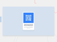
Design comparison
SolutionDesign
Community feedback
- @denieldenPosted over 2 years ago
Hi Siddhi, great job!
- try to use flexbox to the body for center the card. Read here -> flex guide
- remove all
marginfromboxbecause with flex they are superfluous. - after set
heigthof body to100vhbecause Flexbox aligns to the size of the parent container. - add
maintag and wrap the card for Accessibility - Also instead of using
pxtry to use relative units of measurement -> read here
Overall you did well! Hope this help ;)
Marked as helpful1@siddhiePosted over 2 years ago@denielden Thank you for your valueable feedback. I'll work on it.
1@denieldenPosted over 2 years ago@Siddhinandaniya You are welcome! And don't forget to mark my comment as helpful :) thanks
Marked as helpful0@siddhiePosted over 2 years ago@denielden Hi, I've updated my QR-Code project after you gave me your feedback. It helped a lot.
Could you check once again my updated project?
Thank you ;)
1@denieldenPosted over 2 years ago@Siddhinandaniya done! Now it's much better, great job keep it up :)
1
Please log in to post a comment
Log in with GitHubJoin our Discord community
Join thousands of Frontend Mentor community members taking the challenges, sharing resources, helping each other, and chatting about all things front-end!
Join our Discord

