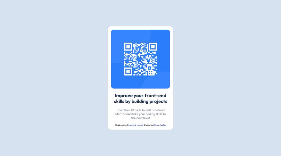
Design comparison
SolutionDesign
Solution retrospective
What are you most proud of, and what would you do differently next time?
I am proud of making this project
What challenges did you encounter, and how did you overcome them?I had a problem in centering the container then I found a solution for it by giving body element a height of 100%, setting it's display to flex, justifying content to center and aligning items to center.
What specific areas of your project would you like help with?I can't say that my solution is perfect 👌🏻 but if you have any suggestions then I am open for that 😀
Please log in to post a comment
Log in with GitHubCommunity feedback
No feedback yet. Be the first to give feedback on DivasJaglan's solution.
Join our Discord community
Join thousands of Frontend Mentor community members taking the challenges, sharing resources, helping each other, and chatting about all things front-end!
Join our Discord
