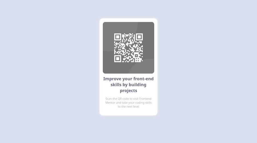
Responsive QR-Code layout with some hovering and transition effects
Design comparison
Solution retrospective
I am proud of me doing it better everyday . I would like to add more functionalities next time to my project.
What challenges did you encounter, and how did you overcome them?The challenges i mainly encountered was making it responsive , But after focusing a bit i made the website responsive for all devices.
What specific areas of your project would you like help with?I would like to hear suggestions or improvement in my project.
Community feedback
- @danielmrz-devPosted 6 months ago
Hello there!
Congrats on completing the challenge! ā
Your project is looking fantastic!
I'd like to suggest a way to make it even better:
- Although it works, using
position
isn't always the most effective method for centering an element. It can cause bugs and may result in part of the content being cut off depending on the lenght of the card.
Here's a highly efficient approach to position an element at the center of the page both vertically and horizontally:
š Apply this CSS to the body (avoid using
position
ormargins
in order to work correctly):body { min-height: 100vh; display: flex; justify-content: center; align-items: center; }
I hope you find this helpful!
Keep up the excellent work!
Marked as helpful0@pavans5097Posted 6 months agoThankyou for your wonderful feedback . It was really helpful for me . @danielmrz-dev
1 - Although it works, using
- @GSida015Posted 6 months ago
COOL! you have good skills in css...
BUT................
You should follow the actual template,there's no need anything special like that. Yes you did what you told to but if in template there isn't providen specific image or detail that in this projects something should have hover effect you shouldn't do it...
This website is all about getting experience! When you will get a job there will be providen a template... that you should follow!
But in summary your solution is great!
I hope I explained everything you needed! I would be glad if you mark this helpful!
GOOD LUCK IN YOUR NEXT PROJECTS!!!
Marked as helpful0@pavans5097Posted 6 months agoI am glad to hear your suggestion . I know this project is little off from the template but i will follow the template from next project @GSida015
2@danielmrz-devPosted 6 months ago@GSida015 @pavans5097
I have another perspective on this. Of course you should follow the template, but you can also customize your projects whenever you can, specially when you do it for practice.
I always customize my projects when I have the chance. Not because I wanna make it more beautiful or anything like that, but when I wanna practice a new technology or some CSS skills that I'm trying to improve.
Of course you can't do this on a job, but remember: You are practicing here.
Marked as helpful1@GSida015Posted 6 months ago@danielmrz-dev I have very same perspective but I made it clear for him...because when he starts his professional career he knew that.I don't talk about in Frontend Mentor or any practice projects.
1@pavans5097Posted 6 months agoThat's great , i know i didn't follow template but i am learning these things , by customizing project i was able to study and apply filter , box-shadow , hover etc .For learning i think customizing would be good but it wouldn't be in case of working in a company @danielmrz-dev
2
Please log in to post a comment
Log in with GitHubJoin our Discord community
Join thousands of Frontend Mentor community members taking the challenges, sharing resources, helping each other, and chatting about all things front-end!
Join our Discord