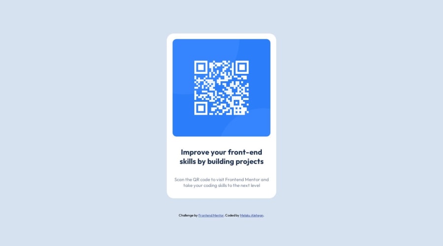
Responsive QR-Code component using flexbox and media query
Design comparison
Solution retrospective
I have used media query for mobile device view, but seems like the component just keeps getting thinner when the page is between 375px and 900px so I have to write another media query for this range, to adjust the width of the card. will this be possible without the extra media query I wrote? or is there a different approach to the desktop version css I wrote?
Community feedback
- @Ahmed-Seleem01Posted almost 2 years ago
Congratulations for completing this challenge.
You asked about using media queries . I think it's better to rely on natural responsive of the css before relying on media queries, I have finished this challenge without using any media queries just use flex box this will make your component flexible and you can set the width or the minimum width of the component to not get thinner. Then you can use padding and margin to adjust the spacing of the items inside the component.
Marked as helpful2@MelakuAlehegnPosted almost 2 years ago@Ahmed-Seleem01 Thanks for your feedback. As I have seen your code and some other's solutions you all have set the width of the container to be same in pixels, I have used % for width, I think that might have been the reason I'm obliged to use media query. I appreciate your response Ahmed.
1
Please log in to post a comment
Log in with GitHubJoin our Discord community
Join thousands of Frontend Mentor community members taking the challenges, sharing resources, helping each other, and chatting about all things front-end!
Join our Discord
