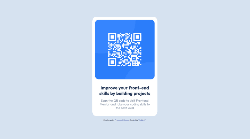
Design comparison
Solution retrospective
I found the project relatively easy-going, although I did find it hard aligning main text to break at the same point as the design example.
I resorted to font sizing, left-right padding and word-break but I would love to hear suggestions on how to do it different if there are easier solutions.
Overall feedback and/or suggestions of code changes would be greatly appreciated for me to take into my next projects. :)
Community feedback
- @MelvinAguilarPosted over 1 year ago
Hello there ๐. Good job on completing the challenge !
I have some suggestions about your code that might interest you.
HTML ๐ท๏ธ:
- Use semantic elements such as
<main>
and<footer>
to improve accessibility and organization of your page.
Alt text ๐ท:
- The
alt
attribute should not contain the words "image", "photo", or "picture", because the image tag already conveys that information.
-
The
alt
attribute should explain the purpose of the image. Uppon scanning the QR code, the user will be redirected to the frontendmentor.io website, so a betteralt
attribute would beQR code to frontendmentor.io
If you want to learn more about the
alt
attribute, you can read this article. ๐.
I hope you find it useful! ๐ Above all, the solution you submitted is great!
Happy coding!
Marked as helpful1@TanDevvPosted over 1 year ago@MelvinAguilar Thank you for your feedback! Your suggestions were very helpful and (to be honest) usually I always go about my projects being semantic with my HTML as you suggested but this time I think I simply forgot to! I will make sure to remind myself when typing up my HTML.
Thank you for informing me more about the
alt
tag too, I will take on your advice with my future projects. :)0 - Use semantic elements such as
Please log in to post a comment
Log in with GitHubJoin our Discord community
Join thousands of Frontend Mentor community members taking the challenges, sharing resources, helping each other, and chatting about all things front-end!
Join our Discord