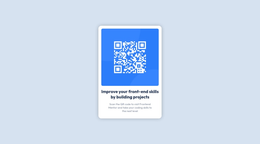
Design comparison
Solution retrospective
I struggled with getting the card to size properly using a grid. I also struggled with the image not centering its container which caused padding and margin issues for the container.
I'm mostly unsure of the font and font-sizing, but I was able to replicate the same visual at 1440px and 576px using the provided requirements, so I'm satisfied with the outcome.
Community feedback
- @denieldenPosted about 2 years ago
Hello Chris, You have done a good work! 😁
Some little tips to improve your code:
- use
maintag to wrap the card and improve the Accessibility but not as a container of that one element - also you can use
articletag instead of a simpledivto the container card for improve the Accessibility imgelement must have analtattribute, it's very important!- add descriptive text in the
altattribute of the images - remove all
marginfrommainbecause with grid they are superfluous - instead of using
pxuse relative units of measurement likerem-> read here
Keep learning how to code with your amazing solutions to challenges.
Hope this help 😉 and Happy coding!
Marked as helpful1@imjustamygdalaPosted about 2 years ago@denielden Thank you very much for the comment and I will most definitely implement these improvements!
1@denieldenPosted about 2 years ago@imjustamygdala You are welcome and keep it up :)
1@imjustamygdalaPosted about 2 years ago@denielden I've now updated the code base and after a lot of testing and new iterations, I think I've got it about as close as I can get. I believe the screenshot comparison is a bit off, or there is some discrepancy between Chrome's Dev Tools and what's captured by frontend mentor, but I'm fairly satisfied with the end results.
I've updated the
<main>tag and reworked the<div>tag as an<article>tag so that's it's not a container for just one item. The idea is that if I wanted to add more<article>tags to add more cards, then I should be able to simply define the columns in CSS.I've also added an
altattribute, and hopefully gave it a useful description.As far as using
px, I tried to userem/emwhere applicable. I determined the card is 350px's wide, so I hard coded the value to help with some sizing issues.I also setup Flexbox for the cards content tags, and that seemed to help out tremendously, however, I still feel like I couldn't get the image to scale down properly.
I probably struggled the most with getting the cards content to scale to any defined values for their parent container, or at least that's what I spent most of this refactor doing.
Thank you again for the advice and encouraging words!
1 - use
Please log in to post a comment
Log in with GitHubJoin our Discord community
Join thousands of Frontend Mentor community members taking the challenges, sharing resources, helping each other, and chatting about all things front-end!
Join our Discord
