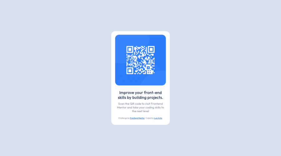
Design comparison
SolutionDesign
Community feedback
- @CreixzPosted over 2 years ago
Hello my friend, Congratulations for finish the project, its seems pretty good, but I have some suggestions regarding your solution if you don't mind:
- Use BEM methodology it's a good practice, like this:
<div class="card"> <div class="card__header"> <img class="card__img" src="images/image-qr-code.png" alt="Qr-Code">- Put the card inside the container, like this:
<section class="container"> <div class="card">- Don't use and specific
heightfor the img, just usewidth= 100%;to adjust to the container and not use unnecessarymargin-top.
Thank you for taking the time to read my feedback I hope it helps.
Marked as helpful0@luizariloPosted over 2 years ago@Creixz thanks for the tips. About the height, I try to use width = 100%, but it didn't look like the mockup. Can you help me with this?
I made the suggested modifications to use the BEM methodology.
0
Please log in to post a comment
Log in with GitHubJoin our Discord community
Join thousands of Frontend Mentor community members taking the challenges, sharing resources, helping each other, and chatting about all things front-end!
Join our Discord
