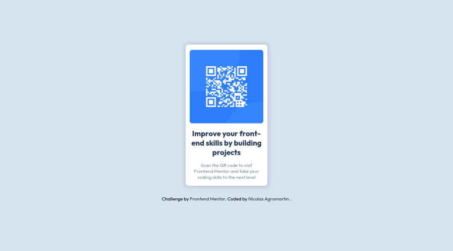
Design comparison
SolutionDesign
Community feedback
- @VyonyxPosted over 1 year ago
Hello Nicolas, great solution.
A couple points to think about:
- Making the card wider will allow the text to fit on two lines instead of three.
- The text at the bottom seems to have a bit of bottom margin/padding when looking at the design file.
Marked as helpful1
Please log in to post a comment
Log in with GitHubJoin our Discord community
Join thousands of Frontend Mentor community members taking the challenges, sharing resources, helping each other, and chatting about all things front-end!
Join our Discord
