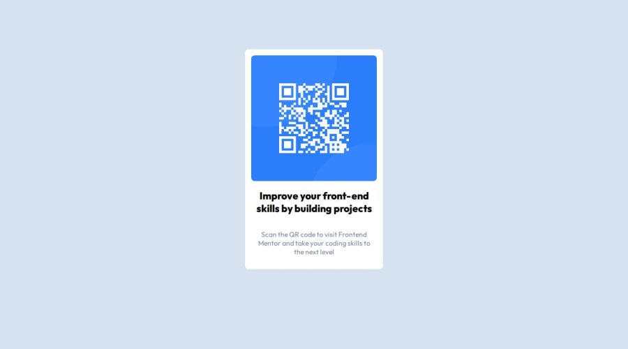
Responsive QR using CSS Flexbox and mediaqueries
Design comparison
Solution retrospective
As all things i code, my first thought always is "This is pretty easy, i should do it just for shape my skills a little better. 40 min for do it" And then, 2 hours to realize.
Html was pretty simple, but i had to start to struggle with the css. I hate looking sizes for the images, and responsive. But with mediaqueries and % sizes, i could finally made the qr responsive.
What challenges did you encounter, and how did you overcome them?The images. I really dont like them. The way of making not only fit in the container, but also make them responsive is pretty easy and the same time, tedius as nothing else.
What specific areas of your project would you like help with?I need really to keep practicing css. thats all.
Community feedback
- @hinn1411Posted 7 months ago
- Firstly, It seems to me that the border-radius of your card is not right. It is maybe
20pxinstead - Secondly, the color of the content is dark blue while yours is black
- Thirdly, the position the the card container is not center vertically, I also had the same problem!
- Fourthly, I think the design had a shadow effect, I forgot to add the effect as well :(
I hope that my feedback is worth to you^^
Marked as helpful1 - Firstly, It seems to me that the border-radius of your card is not right. It is maybe
Please log in to post a comment
Log in with GitHubJoin our Discord community
Join thousands of Frontend Mentor community members taking the challenges, sharing resources, helping each other, and chatting about all things front-end!
Join our Discord
