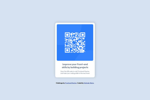
Design comparison
Solution retrospective
I am glad that I have been able to use the flexbox module in CSS very well and next time I will try to integrate the project into react framework
What challenges did you encounter, and how did you overcome them?I went through online platform like CSS guide library and I am happy that I was able to solve the challenges
What specific areas of your project would you like help with?I will be glad if my colleagues can help me on how to properly align the background image with both flex and grid items because the thing is very stressful for me
Community feedback
- @grace-snowPosted 2 days ago
I can see some problems in this I'm afraid. Most are very common beginner mistakes. Generally, you're just making this more complicated than it needs to be.
- In the HTML the only problems relate to the image. The div wrapping it is unnecessary so can be removed. But more important is that this image needs properly written alt text. Remember,
alt
on images is very important and is content not code. This alternative description needs to say what this image is (QR code) and where it goes (to FrontEndMentor.io). - This challenge doesn't need any media query. You can remove the whole thing. But for future reference when you do need them, you'd make the mobile styles the default, then add a min-width media query at the point where there is room for the layout to change. This post may help: https://fedmentor.dev/posts/responsive-meaning/
- Always add a full modern CSS reset at the start of the styles in every project you ever do. Look up Andy Bell's or Josh Comeau's. Both are good examples with blog articles explaining their choices. Use one of them every time at the very start of the CSS.
- Nothing in this challenge should have a width or height. The image can optionally have a
width: 100%
but all it really needs is already included in the CSS reset:display: block; max-width: 100%;
. The card only needs a max-width in rem so that it can shrink narrower when necessary like on small screens. Optionally, you can give the card a width 100% like the image, but again it's not usually necessary. - Don't give the card large margins. It's making the component far too narrow. Instead, just give the body in this a little padding on all sides in px so that the component can't hit screen edges. This may help you understand the difference between padding and margin
- the footer attribution shouldn't be position absolute. It is currently overlapping content at various screen sizes. Just let it sit in its natural position underneath the main.
- Font size should never be in px. Use rem. https://fedmentor.dev/posts/font-size-px/
- Don't style on IDs! That's not what they are for. This would currently make the component unusable on a real site because IDs must always be unique so a site couldn't use more than one instance of this component on a page. It also makes the styles fragile and difficult to maintain. Use single class selectors for styling. If you want to understand the ID attribute better and what's it's meant to be used for, I've written up a fuller post about that too: https://fedmentor.dev/posts/id-attribute-masterclass/
- Instead of setting a width in % on the text content, which loses control (you never know what that percentage equates to), set a max-width in either
ch
orrem
units. That will scale nicely still but you have full control over what it means.
Marked as helpful2@war-rizPosted 2 days agoThank you for your feedback. I will go through it again @grace-snow
0 - In the HTML the only problems relate to the image. The div wrapping it is unnecessary so can be removed. But more important is that this image needs properly written alt text. Remember,
Please log in to post a comment
Log in with GitHubJoin our Discord community
Join thousands of Frontend Mentor community members taking the challenges, sharing resources, helping each other, and chatting about all things front-end!
Join our Discord