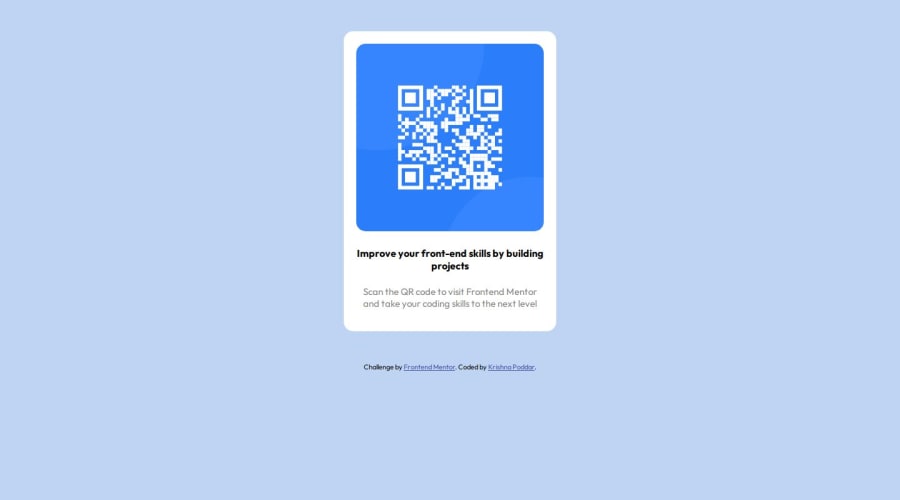
Design comparison
Solution retrospective
It was a good exercise to start of. I would love to add animation to it to scale it up when hovered over it.
What challenges did you encounter, and how did you overcome them?None as such.
What specific areas of your project would you like help with?What could be improved here and is the way of coding correct. Any other suggestions will help.
Community feedback
- @DanijelAdrinekPosted 8 months ago
Hey Krishna I liked your project and decided to take a look at it for a bit, and I found some things I think you can improve on.
-
You should remove the margin on the body, and give height: 100%; values to both the body and html tag
-
after doing that you can add position: relative; to body tag, and position: absolute; to card, then add transform: translate(-50%, -50%); to center the card in the middle of the page.
-
You should add the text together in one div that should be called text-container, it makes it easier to manipulate the text like that, especially if you're good at using flexbox!
-
Use CSS variables, they are a powerful tool to help make your code more readable and easy to manipulate
I hope these tips help you become a better web developer, and help you on your journey towards getting this amazing job, and if you want to learn more mind-blowing tips on solving this challenge, I did actually make a blog post that shows how to properly do that, so if you are interested in learning more, here is the link for that:
https://dev.to/danijeladrinek/frontend-mentor-qr-code-challenge-4g9h
if you have any more questions feel free to let me know, have an amazing day, and happy coding :)
Marked as helpful1@KrishnaPoddar1Posted 8 months agoHey @DanijelAdrinek. Thank you for taking your time to give me this advice. I have utilized them in my projects hereafter. There's one thing I dont understand though why should I give the body and html tags a height of 100%?
1@DanijelAdrinekPosted 8 months ago@KrishnaPoddar1 to take up the entire screen of the user, and properly center the card in the middle of user's screen
0 -
Please log in to post a comment
Log in with GitHubJoin our Discord community
Join thousands of Frontend Mentor community members taking the challenges, sharing resources, helping each other, and chatting about all things front-end!
Join our Discord
