Design comparison
Community feedback
- @Munsif-AliPosted almost 2 years ago
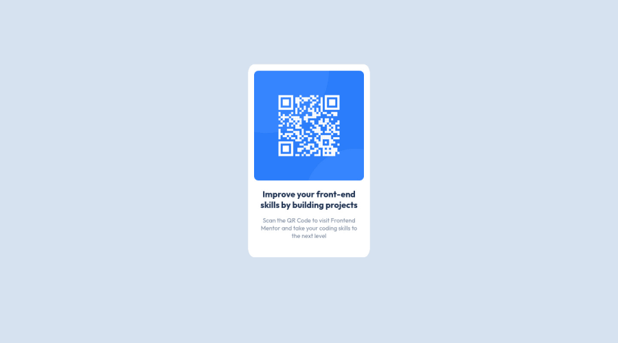
When viewed on a small screen, the design appears pleasing to the eye. However, as the width of the screen expands beyond 450, the design begins to break and lose its cohesive appearance. The optimal viewing experience can be attained at a width of 1210. As the screen continues to widen towards 1900, the design once again begins to fragment and lose its overall harmony.
If you require assistance in resolving these issues, please do not hesitate to reach out to me. I would be delighted to assist you and collaborate with you in resolving these design challenges.
0@samith2002Posted almost 2 years ago@Munsif-Ali Sure! help me to figure out this thing.
0@Munsif-AliPosted almost 2 years ago@samith2002 share your github repo link i will try to help you.
0@samith2002Posted almost 2 years ago@Munsif-Ali https://github.com/samith2002/qr-component-Front-end-mentor
0
Please log in to post a comment
Log in with GitHubJoin our Discord community
Join thousands of Frontend Mentor community members taking the challenges, sharing resources, helping each other, and chatting about all things front-end!
Join our Discord
