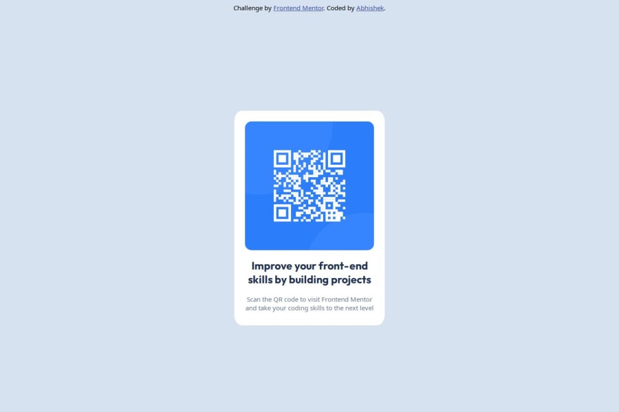


Design comparison
SolutionDesign

Solution retrospective
What are you most proud of, and what would you do differently next time?
I'm proud that I have started my challenege path and would love to learn most out of this. Next time I would use different approach to solve the same challenge. I have used plain CSS in this challenge. Next time I would prefer using Tailwind CSS.
What challenges did you encounter, and how did you overcome them?There were no challenges I faced, since this was a beginner level challenge.
What specific areas of your project would you like help with?I would like to know if my approach and design principles were good enough to be applied in real projects.
Community feedback
- @DarkstarXDDPosted 2 months ago
Couple of suggestions.
- Use meaningful elements. Currently everything is just
divs. divs are good for structuring things and help with layouts, butdivitself is not a semantic element, so it doesn't really have any meaning. - "Improve your front-end..." should be the heading of this card. It can be a
h1. Usually this entire card will be placed in a page along with other elements, so in that case this won't likely be theh1. Theh1would be some other element that explains the content of the entire page. But in the given scenario you can make it ah1. - "Scan the QR code..." should be a
<p>. - Use
remunit forfont-sizes.pxunits won't scale with the browsers font settings, so if the user who visits your webpage have changed their browser default font sizes, they won't be reflected on your page.remon the other hand respects the browsers font settings and change accordingly. So always useremfor font sizes. - The card should not have a fixed
height. It will cause overflowing if the content inside the card changes. You don't have to specify the height of text containers. The browser will automatically calculate it for you based on the content inside the card, and other values like font sizes, paddings etc. - Same way the card should not have a fixed
widtheither. When a fixed width is used the card can't shrink past that value, even if the screen size is small and the card doesn't have any space to fit in. That again will cause overflow issues and break your site. Instead use amax-widthon the card. So you can control how large the card is allowed to be, but at the same time the card has the freedom to shrink automatically when there is no room to fit in smaller screens. - Don't mix
ids andclasses when it comes to styling. Always use classes for styling. Mixing the two will make you run into specificity issues. You can useids when linking two elements together. For example linking an input element with the label element, or when usingaria-describedby. - You should use landmark elements in your page. All the content in your page should be wrapped in a
<main>, except the content in<header>and<footer>. So the<div>that you have given theid="card"should actually be a<main>. The attribution should ideally go inside the<footer>and should be outside of the<main>. - The attribution should be at the bottom of the page, it's bit weird seeing it at the very top like that.
- There's no reason to use
position: absoluteon thecard. Also i don't see a reason for the.card-bodydiv. You can directly use the.carddiv. Try to keep the HTML simple. - I would give the
height: 100vhto thebodyinstead of giving it to that div. And make sure you usemin-heightand notheight. Never limit theheightof thebodyor any element that contains text.
Marked as helpful1 - Use meaningful elements. Currently everything is just

Please log in to post a comment
Log in with GitHub
Join our Discord community
Join thousands of Frontend Mentor community members taking the challenges, sharing resources, helping each other, and chatting about all things front-end!
Join our Discord