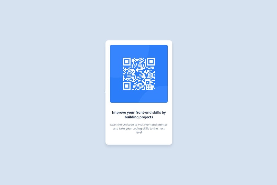
Design comparison
Community feedback
- P@Fable54321Posted 6 months ago
Overall this looks good, now looking more in-depth;
1 I see in your code that you have included all of your css between two section and a <main> section would have been fine.
Still in semantics, why an h3 tag for your big text ? It is clearly the main and only header of the page therefore it should be an h1. h1, h2, h3, h4 are purely semantics tags, if you are to put only one of these tags, it should always be h1 and you ajdust the typography yourself.
3 obviously a few small mistakes with some font-sizes, for that my advice would just be to take your time more.
Good job ! Keep up!
0
Please log in to post a comment
Log in with GitHubJoin our Discord community
Join thousands of Frontend Mentor community members taking the challenges, sharing resources, helping each other, and chatting about all things front-end!
Join our Discord
