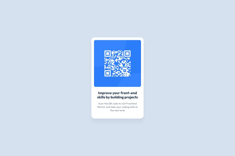
Design comparison
SolutionDesign
Solution retrospective
What are you most proud of, and what would you do differently next time?
I'm proud to finish this whole project and make the component look as similar as possible to the given end result image.
What challenges did you encounter, and how did you overcome them?- Font size - I had to search the web first on how to include a specific font to the project. Also, I had difficulty identifying the font size. I used the given 16px size but for some reasons, I cannot get the exact look of the title of the QR code. I'm also new to reading a Figma file so that's another challenge.
- Card size - I'm not sure if I used the correct size for the QR code area with the white background. I just guessed the size by comparing the given solution image and my solution.
- Shadow - I'm not sure if there is really a box shadow or is it just in my imagination. (Haha!) I ended up not doing it. :(
- Accessibility - I'm not sure if the HTML elements I used are accessible. Could you please check my work and provide feedback regarding this?
- QR Code Size - As I mentioned above, I guessed the size of the QR code container. Where can I get this information from the given files?
- Font Size - I used em as the unit of measure for the image's title. Could you please advise if this is correct?
- Code readability and reusability - Any feedback about how I coded this project will be appreciated. Thank you so much!
Community feedback
Please log in to post a comment
Log in with GitHubJoin our Discord community
Join thousands of Frontend Mentor community members taking the challenges, sharing resources, helping each other, and chatting about all things front-end!
Join our Discord
