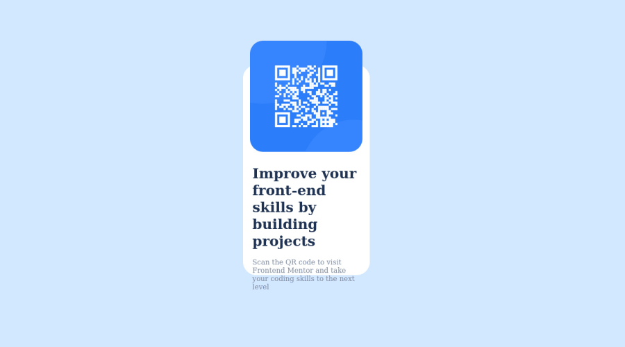
Design comparison
Community feedback
- @CarolkiariePosted about 2 years ago
Hello Kemunto, congratulations on completing the challenge. I have a few suggestion.
-
You could include a css reset . A CSS Reset file targets all rules that the different browsers apply defaults to and resets them to their minimum possible value. This is because different browsers have default rules with properties and values applied to all pages before loading files. Due to the cascading nature of CSS, any styles the browser uses will remain unless explicitly overridden. Here is a css reset that I use often https://www.joshwcomeau.com/css/custom-css-reset/
-
In your code , you only needed to put the display of the container as flex just as you did. Not the card too. The content of the container is overflowing. You only need to set the height of the image, for the rest of the container the height could be set to auto.
happy coding!
0 -
Please log in to post a comment
Log in with GitHubJoin our Discord community
Join thousands of Frontend Mentor community members taking the challenges, sharing resources, helping each other, and chatting about all things front-end!
Join our Discord
