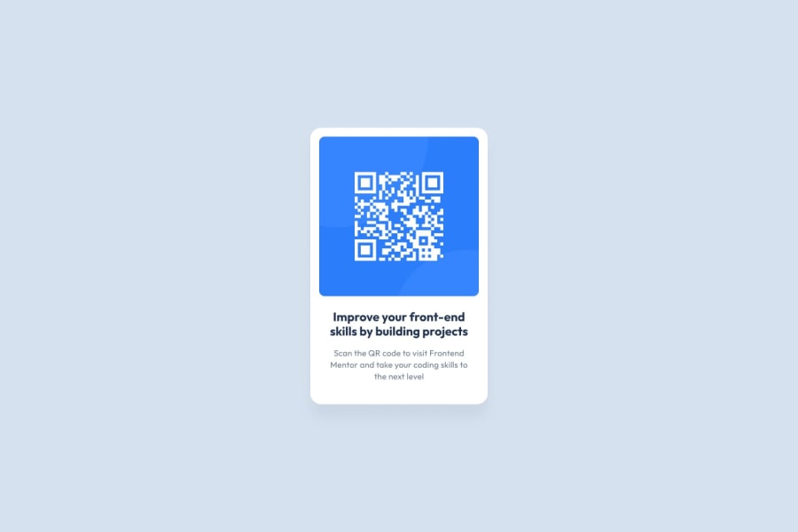
Design comparison
Solution retrospective
I'm practicing accessibility and semantic HTML elements. Do you have any comments regarding my use of these elements?
Community feedback
- @dusan-bPosted about 2 years ago
Hi Leon,
I just had a look at your code, most of it looks pretty good. There are only a few changes I would consider to improve accessibility.
Although skipping heading levels should be avoided, I'm not sure if the
<h1>heading is appropriate in this case. The card is just a component that would most likely be reused on an existing website. Therefore,<h2>or even<h3>would be more realistic.As @tmciesco mentioned, the given alternative text for the image would only cause confusion to screen reader users. You also wouldn't label a link with its URL. Something like "QR code, scan to visit Frontend Mentor" would be more clear about what purpose the image has.
As far as the HTML structure is concerned, the most of it looks reasonable, but you may want to replace
<section>with<article>. MDN makes it very clear, what purpose this element has:"The
<article>HTML element represents a self-contained composition in a document, page, application, or site, which is intended to be independently distributable or reusable [...]. Examples include: a forum post, a magazine or newspaper article, or a blog entry, a product card, a user-submitted comment, an interactive widget or gadget, or any other independent item of content."To be thorough, I would also change the
attrbutioncontainer to be a<footer>element and take it out of<main>.I hope I could help. Keep going, and happy coding. :)
0 - Account deleted
For accessibility, I'd suggest a more accurate alt tag on your image: https://github.com/leonpahole/fm-qr-code-component/blob/main/index.html#L25.
don't know for sure, but my guess is it might be confusing for a screen reader to read a link within an alt tag - and the alt tag is "google.com", even though the qr code is going to frontendmentor.io.
"Frontend Mentor QR Code" is what I used on mine.
Also - and this is a problem with the provided design more than the code, I think - the text color for .card-description is too light on a white background. It only has a contrast ratio of 3.56, and WCAG AA accessibility requires 4.5. I use https://webaim.org/resources/contrastchecker/ to check.
0
Please log in to post a comment
Log in with GitHubJoin our Discord community
Join thousands of Frontend Mentor community members taking the challenges, sharing resources, helping each other, and chatting about all things front-end!
Join our Discord
