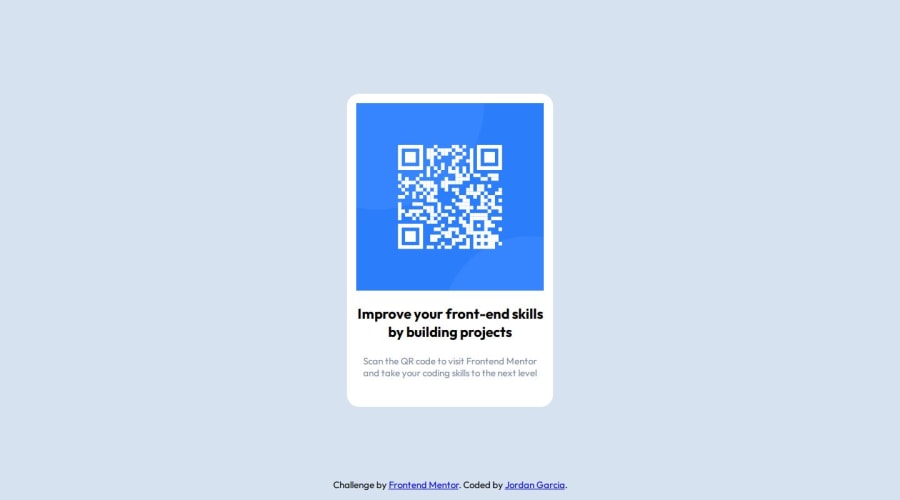
Design comparison
SolutionDesign
Solution retrospective
What are you most proud of, and what would you do differently next time?
I am proud of the responsiveness, but I would like to take a mobile first approach next project.
What challenges did you encounter, and how did you overcome them?I had an issue with footer sizing and the qr "card" at the smallest mobile device screen sizes. I overcame them with media queries and size adjustments (font and element).
What specific areas of your project would you like help with?Properly organizing my code.
Community feedback
- @merveuluserPosted 10 months ago
The text color for the first paragraph seems to be different from the design.
0
Please log in to post a comment
Log in with GitHubJoin our Discord community
Join thousands of Frontend Mentor community members taking the challenges, sharing resources, helping each other, and chatting about all things front-end!
Join our Discord
