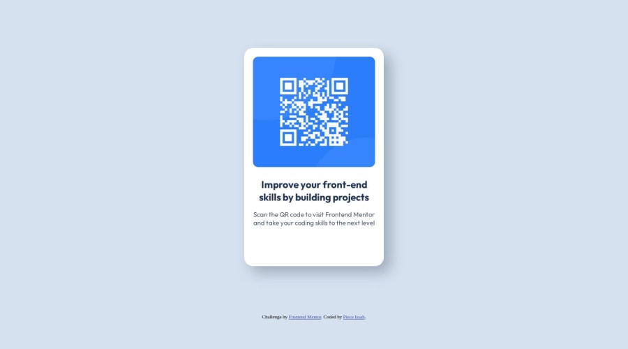
Design comparison
Solution retrospective
What did you find difficult while building the project?
- For me, one of the more challenging tasks was making sure the final build matched up with how it looked in the design files. One of the issues I faced was that either the card was too long or it had way more space compared to the design preview.
Which areas of your code are you unsure of?
- Currently, I am very concerned with the box shadows. I am very sure that someone with a good design eye may also notice that my shadows look off.
Do you have any questions about best practices?
- Although I mention what tools I used, I'm still curious about what other tools to use. Preferably design software used to analyze and break down elements of websites. I'm aware of programs like Figma and Adobe XD, but should I also consider photo editing software such as Photoshop?
Community feedback
- @FluffyKasPosted over 1 year ago
Hey,
It looks good, but you might be overthinking this challenge a bit :) So here's some advice where you could perhaps improve:
-
Do include the image in your HTML. This is a functional, scannable QR code image, so it makes sense that it's part of the markup. This way you can give it an alt text too, so people using screen readers get notified too that there is a scannable image.
-
Whenever you build something, you should use landmarks (header, main, footer, etc). The very least you need a main element that wraps the main content of your web page.
-
If you only use one heading in a web page, it should be h1. Since this is a component - so presumably only a part of a real website -, this isn't a major thing but it's good to be aware of this. Heading levels shouldn't be used for styling, they have a semantic meaning.
-
Setting heights: generally, just don't. You might want to set a height on your body, but even this should be min-height: 100vh and never a fixed height. On pretty much everything else, there's no need to set a height, as all elements have their natural height so use this, and add some padding if you need more.
-
When you struggle with getting the box-shadow right, just remember to stay subtle. In this case, something like this could work: box-shadow:
2px 4px 20px 0px rgba(82, 90, 111, 0.1)
. The x and y offsets (so the first 2 values) are usually small numbers, the 3rd value (blur radius) can be bigger. On the colour, it always works the best if you give it a very very low opacity (like I changed it for you from 0.4 to 0.1).
Really great job on the README file, it's always nice when someone includes it so others can see your thought process and what you've learned. Yay. :)
As to what tools to use: I don't think there is a software that analyses designs and tells you what elements to use, as this can be very subjective. You just learn by doing it :) You don't need any fancy photo-editing tools. At work, most likely you'll be working with Figma design files so a basic understanding of Figma is useful.
Overall, good job, keep it up :)
Marked as helpful1 -
Please log in to post a comment
Log in with GitHubJoin our Discord community
Join thousands of Frontend Mentor community members taking the challenges, sharing resources, helping each other, and chatting about all things front-end!
Join our Discord